 | VS. |  |
Showing posts with label Design. Show all posts
Showing posts with label Design. Show all posts
Tech Book Face Off: Don't Make Me Think Revisited Vs. The Non-Designer's Design Book
I read a lot of technical books about programming languages, development methods, and coding techniques. Those books help enhance my skills in what I do most of the time, which is embedded firmware development, and what I'm interested in, which is learning new programming languages and new ways of solving problems with software. Every once in a while I feel like I should dip my toes into the design side of the pond so I can get a better sense of how to design features that will make the stuff I build easier to use, and so I can better understand the reasons behind what makes a particular design good or bad. For this dip in the pond, I chose Don't Make Me Think Revisited by Steve Krug, a safe book considering that I've already read and loved the previous version of the book. I also picked up a book I've been meaning to read for a while: The Non-Designer's Design Book by Robin Williams, off of a reading list from Joel Spolsky's blog. These books were both quick, enjoyable reads, but let's break it down a little more.
Tech Book Face Off: Design Patterns in Ruby Vs. Practical Object-Oriented Design in Ruby
I've been in a good book-reading mood lately, so I'm writing up yet another Tech Book Face Off. This time I wanted to dig into some more Ruby books, since I've felt like I still have much to learn about this wonderful programming language. I also wanted to work on writing better organized programs, so I targeted some books on program design. The books on deck are Design Patterns in Ruby by Russ Olsen and Practical Object-Oriented Design in Ruby by Sandi Metz. Let's see how they compare with each other and with some of the other books I've read on design.
 | VS. |  |
How to Determine if Something is Good
I recently came across an old article entitled How Art Can Be Good by Paul Graham that I had tagged as something of interest, and I decided to read through it again. In it he argues that art can be good in an objective sense, and that good art is not simply a matter of good taste. I found this article fascinating because while I agreed with his premise that art can be objectively judged, I disagreed with most of Graham's arguments. With most of his articles, he exhibits clear, sound reasoning, and I learn a great deal from his writing. This article is peculiar in that the reasoning seemed much weaker and more vague, but it still made me think deeply about what makes a thing good so I want to explore that idea more carefully.
Keep in mind that Graham's article was written in December of 2006. He may no longer hold the same beliefs that he did when he wrote this article, and I'm not trying to tear down his ideas about good art or attack him in any way. I respect him both as a writer and as a thought leader in the tech startup community. I'm merely attempting to analyze the reasoning in the article and describe my own thoughts on the subject.
Being able to determine if something is good has much practical value, especially if you're the one creating the thing that you hope is good. When creating a work of art, or any other product for that matter, you want to have a keen sense of what makes it good because the better a product is, the more value it will have for more people. I'm going to widen the net well beyond art at this point because the qualities that make art good can apply to almost anything, so we'll be comparing art to music, movies, video games, literature, food, consumer products, Mathematics, and, of course, software.
You Keep Using That Word…
Right from the outset, Graham entangles the idea of good art with good taste in order to disprove that they are equivalent:
One problem with saying there's no such thing as good taste is that it also means there's no such thing as good art. If there were good art, then people who liked it would have better taste than people who didn't. So if you discard taste, you also have to discard the idea of art being good, and artists being good at making it.He later concludes this argument by saying that if there is no way to make art better, then the Sistine Chapel is as good as a blank canvas, and since that's absurd, we have a contradiction. Therefore good art exists. I agree with the conclusion, but the argument is either circular, a straw man, or a slippery slope. I can't decide which one it is.
First, taste is a characteristic of the person who is judging the art, not a characteristic of the art itself, so they are already two different things. It's easy to think of something that I consider to be good, but I personally don't like it. Take music for example. There is plenty of music, whole genres in fact, that I don't like to listen to, but I can still appreciate that songs from those genres take great skill to perform and that plenty of other people like those songs. I also have guilty pleasures that I know aren't that good in a musicality sense, but I enjoy them all the same. Does that mean I have good taste for some music but not other music? No, it means I have varied tastes in music, and my tastes are different than other people's.
Second, good and better are also different things, yet he uses them as if the person with better taste automatically determines what is good taste. The world is not so narrow and simple. Faulkner and Hemingway are both considered good writers (an understatement, I know), but if one person liked both of their works and another person only liked Faulkner, would the person who liked them both have better taste? There are literary experts that like Faulkner's stream of consciousness style and hate Hemingway's terse, matter-of-fact style and plenty of other experts that love Hemingway's writing and hate Faulkner's. They can still agree that both are great authors and are important to read. Neither literary expert is better than the other because of which author they prefer, and the authors are difficult to rank because they are so different from each other.
Finally, each step of this argument doesn't immediately follow the previous step, and I think it is because the definition of good is vague and indeterminable. In the context of art, the word good can have at least two distinct meanings that I've only alluded to so far. Art can be good in the sense that it takes great skill to create, and it can be good in the sense that it evokes strong emotions in the viewers. Art created with great skill can include new techniques that have never been used before. There are numerous examples of famous paintings that were some of the first to use perspective effectively. At the time the technique was discovered, perspective was a difficult skill to master, and the paintings that showed good use of perspective were ground-breaking. Today a painting can't be considered good purely on its use of perspective.
We can see the distinction between these two concepts of good in different kinds of movies. Certain movies break ground with special effects. The Matrix is a great movie partly because so many incredible special effects were invented for it, and they were put to good use telling the story of the movie. On the other hand, I think Mr. Magorium's Wonder Emporium is a great movie partly because of the strong reactions of joy and sadness I get while watching it. I can jump into that movie at any time during the last third of it, and I'll be choked up within minutes.
Good has multiple distinct meanings, and throughout Graham's article the word seems to shift between these two meanings of requiring great skill and evoking strong emotions. It is generally easier to objectively analyze whether or not something requires great skill than it is to analyze that it evokes strong emotions, but they both play a part in making something good. Good can have other meanings as well, in the sense of morality for example, but Graham didn't get into those and I won't, either.
Know Your Audience
After the introduction, Graham goes on an extended discussion of what type of audience we're talking about when someone says that a piece of art is good. Who is the art good for? Who would appreciate the work of art? After touching on a number of characteristics that would appeal to people generally, noting that art can appeal to different groups of people in different ways, and even bringing aliens into the discussion, he settles on all human beings as the intended audience when art is described as good.
I generally agree with his reasoning here, although it is a bit drawn out and the bit about aliens seemed unnecessary. He did overlook an important group of people, though—experts in the field. He was arguably talking about how to judge whether a work of art is good for a general audience, but expert opinion is still important because experts in a field will have a much different perspective on something in their field than the general populace would. Once you have a certain level of knowledge about a given subject, your ideas about what is important, what is difficult, and what is elegant will change dramatically.
In mathematics, proofs that are particularly elegant can be considered beautiful. This is something that the average person will likely not appreciate, but an expert mathematician will see beauty where anyone else would see incomprehensible jargon. Sometimes the beauty comes from structuring a proof in a way that neatly solves the theorem in a more concise way than was thought possible. Other times the beauty comes from building up intricate mathematical machinery, and just when you think things are going to get even more complex, everything falls into place and the solution practically drops out of the proof's structure quite unexpectedly. These are forms of beauty that take intense study and specific knowledge to appreciate.
Experts will also see depth in something that the average person will fail to notice. A good example of this phenomenon happens in video games. Some games have layers of depth in game play that is not at all obvious on a single play-through. Devil May Cry is an old action game from 2001 where you are a half-demon named Dante who fights demons with a sword and guns. At first glance it's a run-of-the-mill action game, but if you spend enough time with it, you'll discover all kinds of expert-level secrets in the game. The enemies and levels are designed so that it's possible to complete every level without ever taking a hit, and the game keeps track of that, giving you bonuses and special rankings for good performance. The holy grail is a perfect SS game where you never take a hit for the entire game and complete each level within its time limit. To achieve this feat, you need to learn special tricks for using your weapons and defeating enemies. The game has a ton of depth that only experts will see and appreciate. Most of the games that are considered the best by expert gamers are like this, and the opinions of the expert audience are important when determining whether a game is good or not.
Comparing Apples and Oranges
Graham moves on to a discussion of how the general public leans in its preferences for art, and how those preferences stem from errors of personal bias and artist's tricks. He claims that good art can't be determined by a vote the way a good apple or a good beach could because the public is easily swayed by branding and advertising. I disagree both with the claim that voting is ineffective in determining if something is good and that apples and beaches are all that different than art.
Regarding voting, it's true that you may not think something is good while the majority of people think it is good, but it's likely that the set of things that come to the top in a vote includes some pretty good stuff. (Let's ignore politicians here because no one's going to agree that that statement holds for them.) Take smart phones as an easy example. People vote for smart phones with their wallet, and the top 10 list of best selling smart phones is dominated by Apple, Samsung and Xiaomi. You may not like iPhones. You may not like Galaxy phones. But it's pretty likely that you'll find a good phone on that list. They all have good performance, good build quality, and good design.
I find voting to be a pretty good guide for finding all kinds of good stuff. It's how I choose books to read on Amazon. I will nearly always pass on a book that gets less than a four-star rating because in my experience, they've been almost universally bad. I have a much better chance getting a good book with a four- or five-star rating, even though the occasional stinker still makes it through. It takes a strong recommendation from someone I trust to convince me to read a three-star rated book, and a rating less than that is out of the question. Life's too short, ya know?
Regarding apples, it seems entirely possible that I would not like an apple that the majority of people vote as being exceptionally good. What if I like sour apples and most people like sweet apples? What if I like my apples tart, covered in cinnamon, and baked in a pie? What if I hate apples? The point is that there are enough kinds of apples in the world that deciding which ones are good isn't all that different than deciding which works of art are good. Reasonable people are going to disagree on what is good art and what is a good apple. It kind of comes down to what tastes good to you, and now we've come full circle.
I Said I'd Talk About Software
All of these ideas about what makes good art or movies or smart phones also applies to software. The definition of good changes slightly because the user of a piece of software likely doesn't care if it took a lot of skill to make nor will it evoke strong emotions of joy or sadness. Maybe it will cause intense frustration, but that shouldn't be a goal. What good software does do is make the user feel highly skilled. It gives the user a great sense of accomplishment because she can do things easily that were difficult or impossible before. It should also be enjoyable to use and help the user feel productive. These things will make the user happy.
Expert users will find elegance and depth in good software. I am continually impressed by the cleanness of features in Firefox and the limitless capabilities of Vim, although I wouldn't say I'm an expert in either, yet. The point is that good software has layers of depth that keep enticing advanced users to explore further and discover new powers to make themselves more awesome. In the end good software, like good art, is still a matter of taste. Some people will like Chrome instead of Firefox. Some people will like Emacs or Sublime instead of Vim. For something to be good, it has to meet the requirements of being high quality and being appealing to an audience, and beyond that people's preferences are going to come down to taste.
So coming back to Graham's article, I think there are ways to determine objectively if art is good, but once those objective criteria are met, we are still left with a wide variety of art. Then it comes down to personal preferences, and different people are going to like different things. Ideally, good art is determined by both objective criteria and taste, and on that we seem to agree.
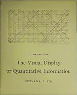
Tech Book Face Off: Envisioning Information Vs. Visual Explanations Vs. The Visual Display of Quantitative Information
I came across glowing recommendations for Edward Tufte's books on a number of blogs, and I finally got around to reading them. They're all fairly short books, filled with charts and graphics, so they didn't take long to get through. I'll say right up front that I have mixed feelings about them. The overarching theme of all three books is apparent from their titles. The goal is to describe to the reader the best way to present information in charts and graphics so that the data can be clearly analyzed without distortion or confusion. Tufte obviously cares deeply about the accurate, unencumbered display of information, and parts of each of these books are excellent. But other parts were frustratingly repetitive or overly simplistic. Let's take a deeper look at the merits of each of these visual manuals for the chart designer.


Tufte warned the reader in the introduction of this book that the prose would be terse, and he wasn't kidding. Don't expect to read a detailed exposition on the design of charts here. The writing is minimalist, bordering on unbearable, but I guess that's the point. The graphics should speak for themselves, and for the most part, they do, although some of them were too small to read easily. I still felt the writing did the book a disservice because the stilted prose made it much less engaging than it could have been.
It's likely that I read this book out of order. I read it first, going by it's publication date, but I think it was actually written after Visual Explanations and possibly also The Visual Display of Quantitative Information (now on its second edition). I think it would have been better to read Envisioning Information after either of the other two books, or even not at all, because it's basically a quick summary of the principles of good chart design with a large number of examples. It's only 100 pages and took a couple hours to read through while examining the charts, and it felt like a series of review exercises for someone who had already been exposed to the material.
The book is split up into six concise chapters: Escaping Flatland, Micro/Macro Readings, Layering and Separation, Small Multiples, Color and Information, and Narratives of Space and Time. Each chapter contains an explanation of the idea and a number of charts and graphics that either exemplify the idea or show how its misuse can corrupt the presentation of data.
Each chapter covers important concepts to think about when designing charts, and in the first chapter, Tufte addresses the restrictions of the 2-dimentional page representing the 3-dimentional world with an analogy to writing. I definitely agree on the restrictiveness of text. Putting certain thoughts or descriptions into a linear sequence, and doing it well, takes a lot of focused effort. Reading explanations and gaining understanding from text is also difficult. Often you need to know many different things at once before you can truly understand a concept, but you can only read one sentence at a time. It takes an accumulation of knowledge before all of the concepts settle out and start to make sense. Designing charts is similarly difficult because charts are flat, but the world is not. Most of the time a chart is trying to distill a large multivariate system into a 2-dimentional representation that can't possibly show everything. The condensation of relevant details and the elimination of superfluous ones is part of what makes a good chart design effective.
A major theme of good chart design is the identification and removal of chartjunk—meaningless graphics and decorations that do not add in the least to the understanding of the data represented. Tufte maintains that charts should be data-rich and data-dense. Chartjunk takes up space that could be used for data at best, and it adds to confusion and distraction at worst.
While carrying the theme of reducing chartjunk through the rest of the book, Tufte covers how data can be layered to reveal new insights at multiple levels of detail, how repeated small charts with variations can bring out patterns through comparison, and how the judicious use of color, lines, and borders can greatly assist in understanding data.
One think I particularly liked about this book, and something that was true of all of his books, was the way his descriptions were always on the same page as the charts they were describing, and if need be, he would repeat a chart so the reader wouldn't have to flip pages to see both the prose and the chart. He even called out this practice at the end of the book:
While Envisioning Information was a set of examples presented in quick succession with little discussion, Visual Explanations was a much more engaging read with a smaller set of more focused examples and deeper analysis. All of the same concepts were covered and then some, and the format was much better.
In the first chapter, Images and Quantities, Tufte discussed the importance of correct scaling and appropriate labels to give perspective on charts and graphics. He cautioned that scale can be used to both illuminate and deceive, so you need to be careful how you use it. It's a fundamental concept that you see misused all the time.
Then the second chapter, Visual and Statistical Thinking: Displays of Evidence for Making Decisions, raised the bar with two great stories about the use of charts in the Cholera Epidemic of London, 1854 and the Challenger explosion. The careful analysis of cholera deaths charted on a map of London helped mitigate the epidemic, although it's debatable whether the removal of the water pump handle from the contaminated well stopped new incidents of the disease or if the contamination was already subsiding. Tufte had some words of wisdom on this matter:
He warns about the perils of data mining—searching for the best representation of the data to prove the desired outcome—and only presenting positive results.
In contrast, the poor presentation of O-ring data prior to the Challenger launch on that cold, fateful January day in 1986 resulted in a disastrous shuttle explosion. The discussion and analysis of both events was excellent, and the book is worth a read for this chapter alone.
Tufte did go a bit far in his criticisms of Richard Feynman and his makeshift experiment to demonstrate how the O-ring material behaves at cold temperatures by submerging it in a cup of ice water at a congressional hearing. Feynman obviously knows the difference between a careful scientific experiment and a theatrical demonstration, and I would give him credit for the effective use of the limited resources available to him to prove a crucial point. I'm sure he was well aware that he was in some part playing political theatre.
The next chapter used the field of magic to show how multiple layers of information can be represented with shading and outlines of objects behind other objects. Magic involves showing one thing to the audience while doing something different in the background. Teaching someone to do magic through pictures involves showing both of these perspectives at once, a valuable skill for representing multiple layers of data in a single graphic.
The rest of the book covered a number of other chart design principles, wrapping up with a chapter on many examples of graphics throughout history—some good, some horrible. This chapter went a bit long, and was not as clear and engaging as the rest. Still, it contained some useful advice on how to represent information in the form of pictures while telling a story in much less space than could be done with words.
This book was my favorite of the three. It largely covered the same chart design principles as the other two books, but it went into more depth and the discussion was more organized. In this book Tufte methodically lays out what makes a good chart design and what will ruin otherwise good data.
He starts off with a nice exposition on the development of charts and graphics over time, and finishes the first chapter with a great summary of graphical excellence:
Throughout the book, Tufte seems to focus too much on increasing the density of information in charts. He advocates shrinking charts down to increase their resolution, and it gives the impression that higher density of information is always better. If a chart doesn't display more than a couple dozen values, he thinks that the data is better shown in a table than a chart. I somewhat disagree with this sentiment. While well-designed, high-density charts can be great for seeing patterns in complex data, simple charts can also be quite illuminating, and not everyone cares to squint to see them. A clean, organized chart of a dozen—or even a half dozen—values can make a point immediately obvious. A table of that same data would take more time and effort to discern the same pattern. Human beings are much better at pattern recognition of visual displays than of rows of numerical values, and the enabling of that recognition should also be a primary concern when displaying data.
Tufte wraps up the book with a summary chapter that brings the over-arching concepts of good design together with a few interesting final thoughts. He advocates a better integration of text and graphics so that they flow together seamlessly, with neither able to stand alone. Instead of referencing graphics in the text with "(See Figure 5)" and attempting to fully describe the graphics in the prose, we should use the text to tell the reader how to interpret the graphics and annotate the graphics directly with concise labels of important features. That's quite a diversion from how we learned to combine graphics and text in school, but it makes some sense. The goal is clarity and understanding, and a well-designed text and graphic combination will have those features without the constant referencing of the graphic in the text, often on a separate page. The information is most easily absorbed when important points are as close to the source as they can get.
Overall, I thought this book was quite good. Tufte covers the principles of chart chart design well, and he shows rather than tells the reader what he means with plenty of thoughtful examples. I would definitely recommend it to anyone who designs visual displays of data or wants to understand what makes a chart clear and effective.
Despite the fact that these are all short books, with less than 500 pages between them and half of that being graphics, I wouldn't recommend reading all of them. They all cover the same topics, more or less, and reading them all gets fairly repetitive. The Visual Display of Quantitative Information is the most complete of the three books, and I would say the most engaging read. Even though I didn't agree with everything, it never failed to help me clarify my own thoughts, and if anything, that is the mark of a good book. If you really enjoy that book and want more, then go for Visual Explanations next. It covers most of the same material in a different way, and the in-depth examples of the Cholera Epidemic and the Challenger Explosion are a great read. Envisioning Information can safely be skipped since it doesn't cover anything new, and the material it does have is more superficial than the other two books. In this case less is more, and The Visual Display of Quantitative Information is enough.
VS.
VS.
Envisioning Information
Tufte warned the reader in the introduction of this book that the prose would be terse, and he wasn't kidding. Don't expect to read a detailed exposition on the design of charts here. The writing is minimalist, bordering on unbearable, but I guess that's the point. The graphics should speak for themselves, and for the most part, they do, although some of them were too small to read easily. I still felt the writing did the book a disservice because the stilted prose made it much less engaging than it could have been.
It's likely that I read this book out of order. I read it first, going by it's publication date, but I think it was actually written after Visual Explanations and possibly also The Visual Display of Quantitative Information (now on its second edition). I think it would have been better to read Envisioning Information after either of the other two books, or even not at all, because it's basically a quick summary of the principles of good chart design with a large number of examples. It's only 100 pages and took a couple hours to read through while examining the charts, and it felt like a series of review exercises for someone who had already been exposed to the material.
The book is split up into six concise chapters: Escaping Flatland, Micro/Macro Readings, Layering and Separation, Small Multiples, Color and Information, and Narratives of Space and Time. Each chapter contains an explanation of the idea and a number of charts and graphics that either exemplify the idea or show how its misuse can corrupt the presentation of data.
Each chapter covers important concepts to think about when designing charts, and in the first chapter, Tufte addresses the restrictions of the 2-dimentional page representing the 3-dimentional world with an analogy to writing. I definitely agree on the restrictiveness of text. Putting certain thoughts or descriptions into a linear sequence, and doing it well, takes a lot of focused effort. Reading explanations and gaining understanding from text is also difficult. Often you need to know many different things at once before you can truly understand a concept, but you can only read one sentence at a time. It takes an accumulation of knowledge before all of the concepts settle out and start to make sense. Designing charts is similarly difficult because charts are flat, but the world is not. Most of the time a chart is trying to distill a large multivariate system into a 2-dimentional representation that can't possibly show everything. The condensation of relevant details and the elimination of superfluous ones is part of what makes a good chart design effective.
A major theme of good chart design is the identification and removal of chartjunk—meaningless graphics and decorations that do not add in the least to the understanding of the data represented. Tufte maintains that charts should be data-rich and data-dense. Chartjunk takes up space that could be used for data at best, and it adds to confusion and distraction at worst.
While carrying the theme of reducing chartjunk through the rest of the book, Tufte covers how data can be layered to reveal new insights at multiple levels of detail, how repeated small charts with variations can bring out patterns through comparison, and how the judicious use of color, lines, and borders can greatly assist in understanding data.
One think I particularly liked about this book, and something that was true of all of his books, was the way his descriptions were always on the same page as the charts they were describing, and if need be, he would repeat a chart so the reader wouldn't have to flip pages to see both the prose and the chart. He even called out this practice at the end of the book:
Descartes did the same thing in his Principia, repeating one particular diagram 11 times. Such a layout makes it unnecessary to flip from page to page in order to coordinate text with graphic.It's a very nice change from most other books I've read with graphics of any kind—programming and text books included—where graphics could be multiple pages removed from their descriptions.
Visual Explanations
While Envisioning Information was a set of examples presented in quick succession with little discussion, Visual Explanations was a much more engaging read with a smaller set of more focused examples and deeper analysis. All of the same concepts were covered and then some, and the format was much better.
In the first chapter, Images and Quantities, Tufte discussed the importance of correct scaling and appropriate labels to give perspective on charts and graphics. He cautioned that scale can be used to both illuminate and deceive, so you need to be careful how you use it. It's a fundamental concept that you see misused all the time.
Then the second chapter, Visual and Statistical Thinking: Displays of Evidence for Making Decisions, raised the bar with two great stories about the use of charts in the Cholera Epidemic of London, 1854 and the Challenger explosion. The careful analysis of cholera deaths charted on a map of London helped mitigate the epidemic, although it's debatable whether the removal of the water pump handle from the contaminated well stopped new incidents of the disease or if the contamination was already subsiding. Tufte had some words of wisdom on this matter:
... the credibility of a report is enhanced by a careful assessment of all relevant evidence, not just the evidence overtly consistent with explanations advanced by the report. The point is to get it right, not to win the case, not to sweep under the rug all the assorted puzzles and inconsistencies that frequently occur in collections of data.
He warns about the perils of data mining—searching for the best representation of the data to prove the desired outcome—and only presenting positive results.
In contrast, the poor presentation of O-ring data prior to the Challenger launch on that cold, fateful January day in 1986 resulted in a disastrous shuttle explosion. The discussion and analysis of both events was excellent, and the book is worth a read for this chapter alone.
Tufte did go a bit far in his criticisms of Richard Feynman and his makeshift experiment to demonstrate how the O-ring material behaves at cold temperatures by submerging it in a cup of ice water at a congressional hearing. Feynman obviously knows the difference between a careful scientific experiment and a theatrical demonstration, and I would give him credit for the effective use of the limited resources available to him to prove a crucial point. I'm sure he was well aware that he was in some part playing political theatre.
The next chapter used the field of magic to show how multiple layers of information can be represented with shading and outlines of objects behind other objects. Magic involves showing one thing to the audience while doing something different in the background. Teaching someone to do magic through pictures involves showing both of these perspectives at once, a valuable skill for representing multiple layers of data in a single graphic.
The rest of the book covered a number of other chart design principles, wrapping up with a chapter on many examples of graphics throughout history—some good, some horrible. This chapter went a bit long, and was not as clear and engaging as the rest. Still, it contained some useful advice on how to represent information in the form of pictures while telling a story in much less space than could be done with words.
The Visual Display of Quantitative Information
This book was my favorite of the three. It largely covered the same chart design principles as the other two books, but it went into more depth and the discussion was more organized. In this book Tufte methodically lays out what makes a good chart design and what will ruin otherwise good data.
He starts off with a nice exposition on the development of charts and graphics over time, and finishes the first chapter with a great summary of graphical excellence:
Graphical excellence is the well-designed presentation of interesting data—a matter of substance, of statistics, and of design.Those are the goals to shoot for when designing graphics, and the next chapter dives into an equally nice exposition on how to reveal the truth in graphs. This chapter concludes with another nice summary, this time of principles for graphical integrity:
Graphical excellence consists of complex ideas communicated with clarity, precision, and efficiency.
Graphical excellence is that which gives to the viewer the greatest number of ideas in the shortest time with the least ink in the smallest space.
Graphical excellence is nearly always multivariate.
And graphical excellence requires telling the truth about the data.
The representation of numbers, as physically measured on the surface of the graphic itself, should be directly proportional to the numerical quantities represented.After laying the foundation of graphical excellence and integrity, Tufte uses the rest of the book to show how to achieve these ends. I especially enjoyed the chapter Data-Ink Maximization and Graphical Design, where Tufte redesigns a number of different types of plots. Some redesigns I liked, some I didn't, but all of them made me think about why I preferred certain designs. His redesign of the histogram was pretty slick. He removed the chart border and tick marks, instead putting white lines through the bars themselves to mark grid values. It had a very clean look. On the other hand, I thought his redesign of the box plot with a new plot called a quartile plot—with its middle line offset from the line showing the extents of the data—was less clear than the original. I prefer a box plot with dots showing the max and min of the data set, a line going from the second to the third quartile, and a short cross bar at the mean. It's still minimalist while being much easier to discern the important qualities of the plot. Most of his redesigns don't seem to have caught on since this is the first I've seen of them in many years of looking at innumerable charts and graphs.
Clear, detailed, and thorough labeling should be used to defeat graphical distortion and ambiguity. Write out explanations of the data on the graphic itself. Label important events in the data.
Show data variation, not design variation.
In time-series displays of money, deflated and standardized units of monetary measurement are nearly always better than nominal units.
The number of information-carrying (variable) dimensions depicted should not exceed then number of dimensions in the data.
Graphics must not quote data out of context.
Throughout the book, Tufte seems to focus too much on increasing the density of information in charts. He advocates shrinking charts down to increase their resolution, and it gives the impression that higher density of information is always better. If a chart doesn't display more than a couple dozen values, he thinks that the data is better shown in a table than a chart. I somewhat disagree with this sentiment. While well-designed, high-density charts can be great for seeing patterns in complex data, simple charts can also be quite illuminating, and not everyone cares to squint to see them. A clean, organized chart of a dozen—or even a half dozen—values can make a point immediately obvious. A table of that same data would take more time and effort to discern the same pattern. Human beings are much better at pattern recognition of visual displays than of rows of numerical values, and the enabling of that recognition should also be a primary concern when displaying data.
Tufte wraps up the book with a summary chapter that brings the over-arching concepts of good design together with a few interesting final thoughts. He advocates a better integration of text and graphics so that they flow together seamlessly, with neither able to stand alone. Instead of referencing graphics in the text with "(See Figure 5)" and attempting to fully describe the graphics in the prose, we should use the text to tell the reader how to interpret the graphics and annotate the graphics directly with concise labels of important features. That's quite a diversion from how we learned to combine graphics and text in school, but it makes some sense. The goal is clarity and understanding, and a well-designed text and graphic combination will have those features without the constant referencing of the graphic in the text, often on a separate page. The information is most easily absorbed when important points are as close to the source as they can get.
Overall, I thought this book was quite good. Tufte covers the principles of chart chart design well, and he shows rather than tells the reader what he means with plenty of thoughtful examples. I would definitely recommend it to anyone who designs visual displays of data or wants to understand what makes a chart clear and effective.
Less is More
Despite the fact that these are all short books, with less than 500 pages between them and half of that being graphics, I wouldn't recommend reading all of them. They all cover the same topics, more or less, and reading them all gets fairly repetitive. The Visual Display of Quantitative Information is the most complete of the three books, and I would say the most engaging read. Even though I didn't agree with everything, it never failed to help me clarify my own thoughts, and if anything, that is the mark of a good book. If you really enjoy that book and want more, then go for Visual Explanations next. It covers most of the same material in a different way, and the in-depth examples of the Cholera Epidemic and the Challenger Explosion are a great read. Envisioning Information can safely be skipped since it doesn't cover anything new, and the material it does have is more superficial than the other two books. In this case less is more, and The Visual Display of Quantitative Information is enough.
How Would You Organize 180 Million Websites?
There are currently about 180 million active websites on the internet. Finding what you need is going to be a challenge. Finding the website that meets your needs exactly and gives you a great experience is even harder. Organizing and finding stuff on the web has become a massive industry, with Google, Facebook, and Twitter battling for your precious time to best give you what you're looking for.
It's an extremely hard problem, and Google's method works pretty well for me so I was intrigued when I came across this post by Roy Pessis on how Google is killing the web. He laments about all the awesome websites he finds and how hard it is to find them and recall them when you need them:
This article really got me thinking about how the web could be better, but then a funny thing happened. I got stuck on the enormity of the problem. There is not one, but three main challenges to overcome—challenges that the big internet companies are attacking in various ways and doing a pretty good job of solving already. Any new solution is going to have to do better at all of these issues than the solutions that are currently out there, and that's a lot more difficult than convincing people that there should be a better way to find what they're looking for on the web.
Finding the handful of websites that would best help you among the 180 million websites out there is hard enough, but to do it quickly, billions of times per day for hundreds of millions of users is shockingly difficult. Every user's idea of what they're looking for has its own context. Different websites will align better with different users' needs, even when they deal with the same topics. Finding the best match for everyone has a significant amount of irreducible complexity.
Each of the major internet companies deals with this complexity in a different way. Google attempts to match people to websites with keyword search. They index the web, find the keywords you're looking for in text and links, and return a ranked list of results. The whole process is much more complicated than that, of course, but it's a logical way to look for something in such a massive amount of information.
Facebook takes a different tact. They figure you'll be interested in the same types of things that your friends are interested in. You're likely to want to read or watch the things your friends find, create, and post, so your Facebook feed attempts to show you things from your friends' posts that are likely to interest you. This is not so much directed searching as finding what you're looking for through serendipity. You can find a lot of things you're interested in this way, but not likely what you're looking for right now.
Twitter uses yet another approach. It's similar to Facebook in that you follow other people and see a feed of their posts, but it's much more transient and you see all of the posts, as well as posts by others that respond to those posts. Choosing who to follow based on what you want to see is much more important here. If you carefully select who you follow, you'll have a well-curated feed of highly relevant links, comments, and discussions related to your interests. You do have to put in the time, and like Facebook, you probably wouldn't look to Twitter as a resource for immediate problems. But you can find a lot of valuable stuff this way over time.
Things aren't completely segmented along these lines, and each of these companies uses elements of the other approaches to help you find what you're looking for. Each of them provides a markedly different experience and makes different choices for the trade-offs involved. While none of them are perfect, they all get the job done fairly effectively, and each of them works better in certain situations.
Once you find something valuable on the web, you probably want to save it for later use. If you found it through Google, you may be able to use the same search terms to find it again the next time, if you can remember how you did it. It's even harder to find old stuff on Facebook, and it's nearly impossible on Twitter.
If you want to use the web like your desktop or tablet and store things for frequent use, then you need to "install" the websites you use most with bookmarks or a website like delicious.com. Personally, I use Firefox bookmarks, and they work pretty well. I keep them organized in folders, and I have access to them on any device that has Firefox installed. I can see how they don't scale well, though, and with hundreds of bookmarks, I'm starting to depend more on the search feature.
I don't know how to make bookmarks scale better, but desktops and tablets suffer from the same problem with installed apps. I know people who have installed 200+ apps on their smartphone and are in the same predicament. They can't find what they need when they need it. They need search. Having all of your apps on your desktop, just one click away, doesn't help if you can't find the ones you need in the sea of apps you never use. The desktop isn't really a solved problem. It's a different problem. Trying to make the web more like the desktop isn't going to solve any of the web's problems.
The real problem here is that once you get past a few dozen apps or bookmarks or whatever, it's hard to remember where you put them when you need them unless you've done a great job organizing them yourself. At a certain number of things, it's easier to resort to search. The web is way past that number, so the default is search.
I find that I use search more on the desktop now because it works so well for the web. I reserve the prime real estate on my taskbar for the dozen programs I use the most, and similarly, I have less than a dozen pinned tabs in Firefox for my most-used websites. Keeping more things than this available at once just isn't useful.
I'm sure we've all had the same experience of finding an awesome website, and then wondering why it was so hard to find or why we didn't find it sooner. These websites should be easy to find, right? Everyone should be using them because they're so awesome! But everyone has a different idea of what makes a great website, and there are a lot of different interests out there.
The most popular websites gained their popularity over time, and lots of websites benefit from network effects. They become more useful as more people use them. Sites like Facebook, Twitter, Amazon, and Stackoverflow depend on the sheer volume of users to make the sites better. It takes time and effort to build a site from small beginnings, and a site with lots of potential is much different than a site with millions of users. Not every awesome website is going to make that transition.
There's also the issue of competing in a world where the power law rules. Ben Thompson has an excellent article on how newspapers are suffering from the availability of content:
Every once in a while a new channel comes along that allows new websites to promote themselves easily and get popular, but that only works until the new channel gets saturated. Facebook and Twitter are recent examples. It may seem like app stores are a good model that could be used to promote websites because they've worked so well for smart phone and tablet apps. They've got reviews and ratings, and if you get promoted by Apple or Google, your app can really make it big. But there's still a lot of crappy apps out there with a small amount of great apps to find. iOS now has over 1.2 million apps and Android has well over 1.3 million apps. At those numbers it's not much easier to get noticed in an app store than it is on the web, no matter what the app store is like.
I would absolutely love a better web browsing experience. I think everyone would. I would love to find the best sources on any given topic or task instantaneously without any search effort. Who wouldn't? But who is judging what "best" is? My definition of best is almost guaranteed to be different than anyone else for a large selection of things. Aggregating opinions through ratings can go a long way, but what about the websites that go unnoticed that might be perfect for me? I wouldn't know unless I tried all of the options, and I don't have the time or the inclination to do that for most things.
I'm willing to give up some choice to Google or Amazon in exchange for expediency and something that satisfies my needs—something that is good enough. Taking into account the magnitude of content that is being sifted through, the current browser experience is more than good enough. I would welcome a better solution, but it's probably not going to replace the ones that are already out there. A new solution is going to have to make its own choices on the trade-offs, and it's going to have to first figure out how to organize those 180 million websites.
It's an extremely hard problem, and Google's method works pretty well for me so I was intrigued when I came across this post by Roy Pessis on how Google is killing the web. He laments about all the awesome websites he finds and how hard it is to find them and recall them when you need them:
Every week I find at least one site that blows my mind. I get excited about how this service could evolve into something big, it’s potential to grow into a billion dollar business, and how it can change the face of the Internet.It's a commendable goal to want to improve the web experience and connect people with the companies that can best help them with their needs. If a service could show me the websites that would most efficiently and effectively help me do what I want right now, that would be beyond excellent.
But you won’t find these great sites on the first page of Google results—you might not find them on the first 10. As a result, these services, some of them genuinely life-changing, get lost in the dark recesses of the Internet. Even when you find these gems, you probably won’t think to access them the next time you log on. Their biggest challenge is finding a large enough audience to create a habit around their product.
This article really got me thinking about how the web could be better, but then a funny thing happened. I got stuck on the enormity of the problem. There is not one, but three main challenges to overcome—challenges that the big internet companies are attacking in various ways and doing a pretty good job of solving already. Any new solution is going to have to do better at all of these issues than the solutions that are currently out there, and that's a lot more difficult than convincing people that there should be a better way to find what they're looking for on the web.
How do you find exactly what you're looking for?
Finding the handful of websites that would best help you among the 180 million websites out there is hard enough, but to do it quickly, billions of times per day for hundreds of millions of users is shockingly difficult. Every user's idea of what they're looking for has its own context. Different websites will align better with different users' needs, even when they deal with the same topics. Finding the best match for everyone has a significant amount of irreducible complexity.
Each of the major internet companies deals with this complexity in a different way. Google attempts to match people to websites with keyword search. They index the web, find the keywords you're looking for in text and links, and return a ranked list of results. The whole process is much more complicated than that, of course, but it's a logical way to look for something in such a massive amount of information.
Facebook takes a different tact. They figure you'll be interested in the same types of things that your friends are interested in. You're likely to want to read or watch the things your friends find, create, and post, so your Facebook feed attempts to show you things from your friends' posts that are likely to interest you. This is not so much directed searching as finding what you're looking for through serendipity. You can find a lot of things you're interested in this way, but not likely what you're looking for right now.
Twitter uses yet another approach. It's similar to Facebook in that you follow other people and see a feed of their posts, but it's much more transient and you see all of the posts, as well as posts by others that respond to those posts. Choosing who to follow based on what you want to see is much more important here. If you carefully select who you follow, you'll have a well-curated feed of highly relevant links, comments, and discussions related to your interests. You do have to put in the time, and like Facebook, you probably wouldn't look to Twitter as a resource for immediate problems. But you can find a lot of valuable stuff this way over time.
Things aren't completely segmented along these lines, and each of these companies uses elements of the other approaches to help you find what you're looking for. Each of them provides a markedly different experience and makes different choices for the trade-offs involved. While none of them are perfect, they all get the job done fairly effectively, and each of them works better in certain situations.
How do you remember what you've already found?
Once you find something valuable on the web, you probably want to save it for later use. If you found it through Google, you may be able to use the same search terms to find it again the next time, if you can remember how you did it. It's even harder to find old stuff on Facebook, and it's nearly impossible on Twitter.
If you want to use the web like your desktop or tablet and store things for frequent use, then you need to "install" the websites you use most with bookmarks or a website like delicious.com. Personally, I use Firefox bookmarks, and they work pretty well. I keep them organized in folders, and I have access to them on any device that has Firefox installed. I can see how they don't scale well, though, and with hundreds of bookmarks, I'm starting to depend more on the search feature.
I don't know how to make bookmarks scale better, but desktops and tablets suffer from the same problem with installed apps. I know people who have installed 200+ apps on their smartphone and are in the same predicament. They can't find what they need when they need it. They need search. Having all of your apps on your desktop, just one click away, doesn't help if you can't find the ones you need in the sea of apps you never use. The desktop isn't really a solved problem. It's a different problem. Trying to make the web more like the desktop isn't going to solve any of the web's problems.
The real problem here is that once you get past a few dozen apps or bookmarks or whatever, it's hard to remember where you put them when you need them unless you've done a great job organizing them yourself. At a certain number of things, it's easier to resort to search. The web is way past that number, so the default is search.
I find that I use search more on the desktop now because it works so well for the web. I reserve the prime real estate on my taskbar for the dozen programs I use the most, and similarly, I have less than a dozen pinned tabs in Firefox for my most-used websites. Keeping more things than this available at once just isn't useful.
How do the best sites get noticed?
I'm sure we've all had the same experience of finding an awesome website, and then wondering why it was so hard to find or why we didn't find it sooner. These websites should be easy to find, right? Everyone should be using them because they're so awesome! But everyone has a different idea of what makes a great website, and there are a lot of different interests out there.
The most popular websites gained their popularity over time, and lots of websites benefit from network effects. They become more useful as more people use them. Sites like Facebook, Twitter, Amazon, and Stackoverflow depend on the sheer volume of users to make the sites better. It takes time and effort to build a site from small beginnings, and a site with lots of potential is much different than a site with millions of users. Not every awesome website is going to make that transition.
There's also the issue of competing in a world where the power law rules. Ben Thompson has an excellent article on how newspapers are suffering from the availability of content:
Most of what I read is the best there is to read on any given subject. The trash is few and far between, and the average equally rare.This property applies to all websites, though. It's hard to get noticed unless you're the best because people don't have time to look at much more than a few sources for any given topic. They're going to devote their precious time to the sites that are the most likely to give them good returns on their time investment. That typically means it's the popular sites that get the traffic. To get popular, sites need to have great content and great promotion strategies, or they'll get lost in the sea of other sites.
This, of course, is made possible by the Internet. No longer are my reading choices constrained by time and especially place.
Every once in a while a new channel comes along that allows new websites to promote themselves easily and get popular, but that only works until the new channel gets saturated. Facebook and Twitter are recent examples. It may seem like app stores are a good model that could be used to promote websites because they've worked so well for smart phone and tablet apps. They've got reviews and ratings, and if you get promoted by Apple or Google, your app can really make it big. But there's still a lot of crappy apps out there with a small amount of great apps to find. iOS now has over 1.2 million apps and Android has well over 1.3 million apps. At those numbers it's not much easier to get noticed in an app store than it is on the web, no matter what the app store is like.
I would absolutely love a better web browsing experience. I think everyone would. I would love to find the best sources on any given topic or task instantaneously without any search effort. Who wouldn't? But who is judging what "best" is? My definition of best is almost guaranteed to be different than anyone else for a large selection of things. Aggregating opinions through ratings can go a long way, but what about the websites that go unnoticed that might be perfect for me? I wouldn't know unless I tried all of the options, and I don't have the time or the inclination to do that for most things.
I'm willing to give up some choice to Google or Amazon in exchange for expediency and something that satisfies my needs—something that is good enough. Taking into account the magnitude of content that is being sifted through, the current browser experience is more than good enough. I would welcome a better solution, but it's probably not going to replace the ones that are already out there. A new solution is going to have to make its own choices on the trade-offs, and it's going to have to first figure out how to organize those 180 million websites.
Sometimes Low-Tech is Better
I love high-tech gadgets as much as the next guy. I've got my Kindle DX. I've got my iPod Touch. I've got my Nissan Leaf. And I love 'em all, but sometimes high-tech gadgets end up being a solution in search of a problem. They don't always do what they need to do, and instead pile on superfluous features just to increase the tech factor.
I've come across two examples recently that have put this issue in stark relief for me. The first one is a simple outdoor thermometer. If you were to ask me to recommend a good outdoor thermometer a week ago, I would have probably come up with a digital thermometer with a wireless remote sensor that you put outside. You know, something like this:

This is the current best selling weather thermometer on Amazon, and it gets great reviews to boot. The problem with it is it does way too much. Why do I need to have a clock with the thermometer? I already have umpteen clocks in my house. There is always one within view no matter where I am. I do not need another one. I also don't need to know the indoor temperature of my house. I already know it based on the time of year. In the winter it's 65°F (yeah, we like it cold; put on a sweater, you wuss), and right now it's summer so it's exactly 76°F. I set the thermostat and it sets the temperature. I don't need another thermometer to tell me the same thing. This thermometer also takes four AA batteries. I hope they last a while.
You can, of course, take a step up from the basic digital thermometer with this:

It's your own personal weather station! I really don't know what else to say here, other than this thermometer doesn't solve any additional problems that my iPod Touch doesn't already take care of. I already have an iPod Touch, which does so many other things to boot, so why do I need this?
If you asked me today what my ideal outdoor thermometer is, I'd have to go with this:

Isn't it brilliant? Just slap it on your window, and you can easily read the outside temperature from across the room. No setup, no wireless, and no batteries. It's an elegant solution to the problem of knowing what the temperature is outside. When I get up in the morning and need to know if it's a shorts or a pants day, this thermometer is exactly what I want—no more, no less.
The second high-tech-is-worse example is a feature on a device that tries to be too high-tech for its own good. I got a sleek new Lenovo X1 Carbon ultrabook at work, and for the most part it's awesome. It's fast, light, and really cool. The only problem is the row of F keys at the top. They aren't there. In their place is a long, narrow touch panel. At the far left part of it, you can touch to cycle through three different sets of functions for multimedia, application shortcuts, and the normal F keys. Let me count the problems with this "feature."

First, I have to look down to touch the F key that I want to use. I use the F2, F3, and F5 keys all the time, so much, in fact, that I can use them without looking more easily than most of the number keys. Not so with the touch panel. I have to look to make sure that I touch the right part of the panel, and that slows me down.
Second, there is no tactile feedback. With a touch screen you get plenty of visual feedback from a well-designed interface, but with this touch panel, I get no feedback until I look up at the screen and see that the correct action took place. Granted, I'm just flicking my eyes down and back up, but it's irritating because I never had to do that with normal F keys and it takes me away from what I was trying to do.
Third, the ability to cycle through multiple sets of functions is not a good thing. I can't be sure of which set of functions is currently active without looking at them, and I have to pay attention as I cycle through them to stop on the one that I want. Some functions are also in multiple sets, so it's taking me a while to get comfortable with where all of the functions are. The old way of doing the multimedia functions, where you hold down an Fn key that activates sub-functions on the F keys and navigation keys, was much better because it was consistent and always visible.
Okay, I don't want to think about the touch panel anymore. It's a poorly thought out feature on an otherwise excellent machine. The only reason Lenovo designed it in is because touch sensors are all the rage, and they thought it would be a slick high-tech addition to a new laptop. But while a touch screen may make sense on a laptop, (especially to my three-year-old son who keeps trying to touch the game icons on the taskbar of my laptop at home) this touch panel is useless.
I quickly plugged my trusty Logitech K740 keyboard into the X1 for use at my desk. This is my current favorite keyboard. The feel of the keys is awesome, it's sleek and attractive, and all of the keys are in the right place.
 This is a tried and true layout. There's nothing fancy going on here. It's not even wireless, just a USB cord, and it works flawlessly. The F keys are even grouped into sets of four so that I can easily feel that my fingers are in the right place to press the right keys without looking.
Neither of these products, the digital thermometer nor the X1's touch panel, is solving a problem that really needs solving. It makes me wonder about other high-tech products on the horizon, like the iWatch. I am hesitant to go against any new Apple product because they have shown again and again that there are huge markets for what they come up with, even if the market didn't exist before the product, but I'm still skeptical of the iWatch's usefulness. The tablet and smart phone market has shown that bigger screens are almost universally more desirable. The tiny screen size of a smart watch will severely limit what can be done with it. I'm going to have to see some seriously compelling use cases before trading in my much-loved Timex.
The lesson here (the iWatch's unproven success notwithstanding) is that when designing a product, think about the essence of the product that will make it useful. What was wrong with the way it was done before that can be improved? What problem is this high-tech gadget solving? If redesigning something with the latest tech doesn't significantly improve it, why do it at all?
A digital thermometer that reports temperature to a tenth of a degree both inside and out doesn't give me any more information about whether or not to put on a sweater when going outside. A touch panel with modes instead of dedicated keys doesn't help me type and interact with the computer any faster. It actually slows me down, degrading the primary usefulness of a keyboard. If you need a high-tech feature to make a product significantly better, then by all means, design it in. If you're adding in high-tech features just because they seem shiny and new, think long and hard about what you're doing because you could be wrecking the essence of your product. Sometimes low-tech is better.
I've come across two examples recently that have put this issue in stark relief for me. The first one is a simple outdoor thermometer. If you were to ask me to recommend a good outdoor thermometer a week ago, I would have probably come up with a digital thermometer with a wireless remote sensor that you put outside. You know, something like this:
This is the current best selling weather thermometer on Amazon, and it gets great reviews to boot. The problem with it is it does way too much. Why do I need to have a clock with the thermometer? I already have umpteen clocks in my house. There is always one within view no matter where I am. I do not need another one. I also don't need to know the indoor temperature of my house. I already know it based on the time of year. In the winter it's 65°F (yeah, we like it cold; put on a sweater, you wuss), and right now it's summer so it's exactly 76°F. I set the thermostat and it sets the temperature. I don't need another thermometer to tell me the same thing. This thermometer also takes four AA batteries. I hope they last a while.
You can, of course, take a step up from the basic digital thermometer with this:
It's your own personal weather station! I really don't know what else to say here, other than this thermometer doesn't solve any additional problems that my iPod Touch doesn't already take care of. I already have an iPod Touch, which does so many other things to boot, so why do I need this?
If you asked me today what my ideal outdoor thermometer is, I'd have to go with this:
Isn't it brilliant? Just slap it on your window, and you can easily read the outside temperature from across the room. No setup, no wireless, and no batteries. It's an elegant solution to the problem of knowing what the temperature is outside. When I get up in the morning and need to know if it's a shorts or a pants day, this thermometer is exactly what I want—no more, no less.
The second high-tech-is-worse example is a feature on a device that tries to be too high-tech for its own good. I got a sleek new Lenovo X1 Carbon ultrabook at work, and for the most part it's awesome. It's fast, light, and really cool. The only problem is the row of F keys at the top. They aren't there. In their place is a long, narrow touch panel. At the far left part of it, you can touch to cycle through three different sets of functions for multimedia, application shortcuts, and the normal F keys. Let me count the problems with this "feature."
First, I have to look down to touch the F key that I want to use. I use the F2, F3, and F5 keys all the time, so much, in fact, that I can use them without looking more easily than most of the number keys. Not so with the touch panel. I have to look to make sure that I touch the right part of the panel, and that slows me down.
Second, there is no tactile feedback. With a touch screen you get plenty of visual feedback from a well-designed interface, but with this touch panel, I get no feedback until I look up at the screen and see that the correct action took place. Granted, I'm just flicking my eyes down and back up, but it's irritating because I never had to do that with normal F keys and it takes me away from what I was trying to do.
Third, the ability to cycle through multiple sets of functions is not a good thing. I can't be sure of which set of functions is currently active without looking at them, and I have to pay attention as I cycle through them to stop on the one that I want. Some functions are also in multiple sets, so it's taking me a while to get comfortable with where all of the functions are. The old way of doing the multimedia functions, where you hold down an Fn key that activates sub-functions on the F keys and navigation keys, was much better because it was consistent and always visible.
Okay, I don't want to think about the touch panel anymore. It's a poorly thought out feature on an otherwise excellent machine. The only reason Lenovo designed it in is because touch sensors are all the rage, and they thought it would be a slick high-tech addition to a new laptop. But while a touch screen may make sense on a laptop, (especially to my three-year-old son who keeps trying to touch the game icons on the taskbar of my laptop at home) this touch panel is useless.
I quickly plugged my trusty Logitech K740 keyboard into the X1 for use at my desk. This is my current favorite keyboard. The feel of the keys is awesome, it's sleek and attractive, and all of the keys are in the right place.

Neither of these products, the digital thermometer nor the X1's touch panel, is solving a problem that really needs solving. It makes me wonder about other high-tech products on the horizon, like the iWatch. I am hesitant to go against any new Apple product because they have shown again and again that there are huge markets for what they come up with, even if the market didn't exist before the product, but I'm still skeptical of the iWatch's usefulness. The tablet and smart phone market has shown that bigger screens are almost universally more desirable. The tiny screen size of a smart watch will severely limit what can be done with it. I'm going to have to see some seriously compelling use cases before trading in my much-loved Timex.
The lesson here (the iWatch's unproven success notwithstanding) is that when designing a product, think about the essence of the product that will make it useful. What was wrong with the way it was done before that can be improved? What problem is this high-tech gadget solving? If redesigning something with the latest tech doesn't significantly improve it, why do it at all?
A digital thermometer that reports temperature to a tenth of a degree both inside and out doesn't give me any more information about whether or not to put on a sweater when going outside. A touch panel with modes instead of dedicated keys doesn't help me type and interact with the computer any faster. It actually slows me down, degrading the primary usefulness of a keyboard. If you need a high-tech feature to make a product significantly better, then by all means, design it in. If you're adding in high-tech features just because they seem shiny and new, think long and hard about what you're doing because you could be wrecking the essence of your product. Sometimes low-tech is better.
A Right And A Wrong Way To Design An Interface
Ever since the iPhone was unveiled, interface design for high-tech products has taken center stage. The role may go by many different names - user interface design, user experience, human-computer interaction - with subtle differences in meaning, but the basic idea is the same. How do you best design a product or feature so that its use is simple, obvious, and convenient? The better a designer can answer this question, the more useful and enjoyable the product will be.
The best way to get a handle on this question is to analyze a common interface, but instead of exploring the graphical interface of some app or web site, let's compare the keyless entry systems for the Nissan Leaf and the Toyota Prius. The basic idea of keyless entry is that you can lock and unlock your car without getting out your key or fob. It sounds like a simple task, but simplicity can be much harder than it appears. Even seemingly obvious designs are very easy to get wrong.
Both the Leaf and the Prius have a keyless entry feature that purports to allow the driver to get into the car without rummaging around for a key to unlock it, but they accomplish this feat in slightly different ways. The Leaf has a physical button on the driver and front passenger door handles right where your thumb rests when you reach for the handle. If you have the key fob near the door, you can push the button once to unlock that door. Push it again to unlock all of the doors. Push it a third time to lock all of the doors again. Pushing the button after opening any door will also lock all of the doors.
In comparison, the Prius has a sensor on the inside of the driver door handle that can tell when a hand crosses it. If the key is near the door when this happens, it will quickly unlock before the driver can pull the handle to open the door. To lock all of the doors, there is a pressure-sensitive area on the top front part of the door handle that acts like a button.
The first concern for any design is to get it working. If it doesn't function at a basic level, then there's no point in looking any further. The feature is broken and no amount of beautiful design will save it. Both of these keyless entry systems work flawlessly in the common case, so there's no issue with basic functionality. You can walk up to the driver side door with the key in your pocket and unlock the door with the door handle. It just works.
If you start expanding the situation a bit, though, the Prius design starts revealing problems. Say the temperature outside drops below freezing - not an uncommon occurrence here in Wisconsin for four months out of the year. If you're wearing gloves any thicker than normal driving gloves, the sensor won't recognize your hand and the door won't unlock. You have to pull off a glove and either grab the freezing cold door handle or hunt for your key fob to unlock it, defeating the purpose of keyless entry.
The Leaf's button is nicely rounded and set out far enough from the rest of the handle that you can easily mash it with even the thickest winter gloves on. It's a nice advantage to be able to keep those gloves on while getting into the car. Once inside, the Leaf's essential buttons on the console are large enough to manipulate with thick gloves on so you can leave them on and drive, but I digress.
Expanding our situation even further, let's say you have a kid. Many people have these, and for quite a few years they need to or like to be carried. The contortions involved in carrying a kid and getting at a key in the wrong pocket (it always seems to be in the wrong pocket) could inspire professional gymnasts. To avoid struggling for your keys with the Prius, you have to open the driver door, twist and bend to hit the inside door unlock button, and then go open the door where the child's car seat is - probably on the other side of the car. You can't double-trigger the door handle sensor to unlock all of the car doors, and the sensor only exists on the driver door.
With the Leaf, you can slide to the left, hit the door unlock button twice with a free knuckle, slide to the right (reminds you of being at a wedding reception, doesn't it?), and open the child's door. If you're on the passenger side, reverse left and right and it works just as well because there's a button there, too.
If you're not carrying a kid, this situation still applies if you're carrying anything heavy that you want to drop in the back seat, but what if you want to put that heavy object in the trunk? If you have a Leaf, no problem. Go right up to the hatch, maneuver one of your hands so you can pull up on the hatch release, and the car will unlock the hatch and pop it open for you. Drop the heavy object in and close the hatch. You could walk off without worry at this point to get more heavy stuff because the car is still locked!
Now try the same thing with a Prius. Sorry, you have to go over to the driver door, get your hand around the handle while carrying that heavy object, open the door, find a way to contort yourself to hit the door unlock button on the inside, and go back to the hatch to open it. That's right, the hatch does not have the keyless entry feature. If you don't want to look like an idiot pacing around your car with a heavy package, you'll have to find a way to get at that key in your pocket. Don't forget to lock up when you're done because the whole car is unlocked.
There are many more situations that routinely come up where the Leaf's keyless entry proves to be so much more convenient than the Prius. Why is that? What made key fobs so nice was that you could unlock all of the car doors from anywhere near the car. The person unlocking the car wasn't necessarily going for the driver door. Nissan must have realized this and designed the keyless entry system so that the ability to unlock any door was within easy reach. That makes keyless entry work in almost every situation.
Toyota seems to have gotten distracted by new technology that involves extra sensors that probably play nicely in a dealership showroom with potential customers. And while having a door handle that senses your hand is cool at first, the novelty quickly wears off when you start running into all kinds of situations where the feature is essentially useless. Every time that happens, I get frustrated at the system's inability to meet my needs, and that adds up over time.
When designing an interface, first and foremost it has to work. Both keyless entry systems achieve that. Then the interface should be designed for as many use cases as possible. Nissan nailed this goal, and Toyota came up short. Once those requirements are met, you can design for beauty, aesthetics, and high-tech coolness. Nissan settled for a simple, functional design with utilitarian buttons, and they could improve on this design in the future if they figure out how to solve the not-so-simple sensor issues.
Toyota succeeded in making a sleeker door handle, but you'll end up pulling out your key fob a lot more with a Prius. They misunderstood what makes a good keyless entry system, so almost every case where you really need the system to work, it falls flat. If Toyota would have used their keyless entry design in a wider variety of situations, they likely would have noticed its deficiencies and come up with a better design that would be useful when it counts. Don't make the same mistake with your own designs. Use them in as many real-world situations as you can think of, and make sure they work as simply and conveniently as possible.
The best way to get a handle on this question is to analyze a common interface, but instead of exploring the graphical interface of some app or web site, let's compare the keyless entry systems for the Nissan Leaf and the Toyota Prius. The basic idea of keyless entry is that you can lock and unlock your car without getting out your key or fob. It sounds like a simple task, but simplicity can be much harder than it appears. Even seemingly obvious designs are very easy to get wrong.
A Tale Of Two Keyless Entry Systems
Both the Leaf and the Prius have a keyless entry feature that purports to allow the driver to get into the car without rummaging around for a key to unlock it, but they accomplish this feat in slightly different ways. The Leaf has a physical button on the driver and front passenger door handles right where your thumb rests when you reach for the handle. If you have the key fob near the door, you can push the button once to unlock that door. Push it again to unlock all of the doors. Push it a third time to lock all of the doors again. Pushing the button after opening any door will also lock all of the doors.
In comparison, the Prius has a sensor on the inside of the driver door handle that can tell when a hand crosses it. If the key is near the door when this happens, it will quickly unlock before the driver can pull the handle to open the door. To lock all of the doors, there is a pressure-sensitive area on the top front part of the door handle that acts like a button.
The first concern for any design is to get it working. If it doesn't function at a basic level, then there's no point in looking any further. The feature is broken and no amount of beautiful design will save it. Both of these keyless entry systems work flawlessly in the common case, so there's no issue with basic functionality. You can walk up to the driver side door with the key in your pocket and unlock the door with the door handle. It just works.
If you start expanding the situation a bit, though, the Prius design starts revealing problems. Say the temperature outside drops below freezing - not an uncommon occurrence here in Wisconsin for four months out of the year. If you're wearing gloves any thicker than normal driving gloves, the sensor won't recognize your hand and the door won't unlock. You have to pull off a glove and either grab the freezing cold door handle or hunt for your key fob to unlock it, defeating the purpose of keyless entry.
The Leaf's button is nicely rounded and set out far enough from the rest of the handle that you can easily mash it with even the thickest winter gloves on. It's a nice advantage to be able to keep those gloves on while getting into the car. Once inside, the Leaf's essential buttons on the console are large enough to manipulate with thick gloves on so you can leave them on and drive, but I digress.
Things Diverge From Here
Expanding our situation even further, let's say you have a kid. Many people have these, and for quite a few years they need to or like to be carried. The contortions involved in carrying a kid and getting at a key in the wrong pocket (it always seems to be in the wrong pocket) could inspire professional gymnasts. To avoid struggling for your keys with the Prius, you have to open the driver door, twist and bend to hit the inside door unlock button, and then go open the door where the child's car seat is - probably on the other side of the car. You can't double-trigger the door handle sensor to unlock all of the car doors, and the sensor only exists on the driver door.
With the Leaf, you can slide to the left, hit the door unlock button twice with a free knuckle, slide to the right (reminds you of being at a wedding reception, doesn't it?), and open the child's door. If you're on the passenger side, reverse left and right and it works just as well because there's a button there, too.
If you're not carrying a kid, this situation still applies if you're carrying anything heavy that you want to drop in the back seat, but what if you want to put that heavy object in the trunk? If you have a Leaf, no problem. Go right up to the hatch, maneuver one of your hands so you can pull up on the hatch release, and the car will unlock the hatch and pop it open for you. Drop the heavy object in and close the hatch. You could walk off without worry at this point to get more heavy stuff because the car is still locked!
Now try the same thing with a Prius. Sorry, you have to go over to the driver door, get your hand around the handle while carrying that heavy object, open the door, find a way to contort yourself to hit the door unlock button on the inside, and go back to the hatch to open it. That's right, the hatch does not have the keyless entry feature. If you don't want to look like an idiot pacing around your car with a heavy package, you'll have to find a way to get at that key in your pocket. Don't forget to lock up when you're done because the whole car is unlocked.
How Did Nissan Get It So Right While Toyota Got It So Wrong?
There are many more situations that routinely come up where the Leaf's keyless entry proves to be so much more convenient than the Prius. Why is that? What made key fobs so nice was that you could unlock all of the car doors from anywhere near the car. The person unlocking the car wasn't necessarily going for the driver door. Nissan must have realized this and designed the keyless entry system so that the ability to unlock any door was within easy reach. That makes keyless entry work in almost every situation.
Toyota seems to have gotten distracted by new technology that involves extra sensors that probably play nicely in a dealership showroom with potential customers. And while having a door handle that senses your hand is cool at first, the novelty quickly wears off when you start running into all kinds of situations where the feature is essentially useless. Every time that happens, I get frustrated at the system's inability to meet my needs, and that adds up over time.
When designing an interface, first and foremost it has to work. Both keyless entry systems achieve that. Then the interface should be designed for as many use cases as possible. Nissan nailed this goal, and Toyota came up short. Once those requirements are met, you can design for beauty, aesthetics, and high-tech coolness. Nissan settled for a simple, functional design with utilitarian buttons, and they could improve on this design in the future if they figure out how to solve the not-so-simple sensor issues.
Toyota succeeded in making a sleeker door handle, but you'll end up pulling out your key fob a lot more with a Prius. They misunderstood what makes a good keyless entry system, so almost every case where you really need the system to work, it falls flat. If Toyota would have used their keyless entry design in a wider variety of situations, they likely would have noticed its deficiencies and come up with a better design that would be useful when it counts. Don't make the same mistake with your own designs. Use them in as many real-world situations as you can think of, and make sure they work as simply and conveniently as possible.
What You Should Learn In College, But Will Have To (Probably) Do Yourself
Final exams are over, the semester has come to a close, and all of those lucky college students now get a month of R&R during winter break. I remember those times well, and I especially remember the relief after finishing out another set of challenging courses. I loved my college experience, both the mind-expanding scholastic activities and the exciting extracurricular activities. There is no doubt in my mind that I gained an incredible amount of knowledge and understanding from the time I spent in college, but in looking back over that time, I notice that there was one gaping hole in all of the engineering and computer science coursework I completed. Almost none of the courses even came close to teaching us how to effectively manage and execute real projects.
Now, you may be saying to yourself, "Well, duh! College isn't about doing real projects. It's about learning theory and how to apply that theory to contrived textbook problems." And I would agree, to a point. There is certainly a vast quantity of knowledge surrounding software engineering, a significant portion of which a good Computer Science curriculum should teach. But I also think college students should learn how to use that knowledge in the context of actual software projects, because let's face it, most college grads are going to go work for a company where they will be contributing to projects for the rest of their careers. Only a small subset of them will go through PhD programs and cycle back into academia as professors.
Come to think of it, professors spend most of their time on projects, too. They may be research projects instead of commercial projects, but that doesn't mean they wouldn't benefit from learning how to run projects before they need to do it on the job. Not adequately teaching students how to do software development is kind of like building a car without windows or a steering wheel. The car may have lots of nice features. It could have a good, powerful engine. It might be luxuriously comfortable. But without windows you won't be able to see where you're going, and without a steering wheel you'll have no control over how to get there, anyway.
I can't think of any good reason why colleges couldn't teach good software development practices along with all of the theory they cover on relational databases, algorithms, networks, compilers, and everything else. Development practices are at least as important for efficiently producing high-quality software, and they're certainly not hard concepts to learn. Although they are difficult to master. Maybe it's because the concepts are perceived as easy that colleges don't feel the need to teach them, but that is a terrible disservice to these future programmers.
If students were introduced to good software development practices early in their coursework, they would have a much better chance of developing good habits that will serve them well throughout their professional careers... and their college careers for that matter. From my own experience, university programs don't spend much, if any, time going over the practical aspects of developing software. Even those courses that have you do projects that take more than a couple of days to complete don't introduce good programming practices properly.
Those courses that also expect you to do more significant projects with a group of students aren't any better because the professors still don't give any instruction on how to manage a project within the context of a group. It's as if they expect everyone to either already know how it should be done from high school group work, or they think we'll all pick it up easily on the fly because it's so obvious. And let's face it, your grade depends on it, so that should be incentive enough to spontaneously learn it.
I must admit that I did have one excellent course that involved an extensive project with a team. It was an electrical engineering course, not a computer science course, but it was cross-listed with the computer science department. I don't know of a similar CS-only course for software development. Anyway, this course had the unassuming title of "Digital Engineering Laboratory" and it had the most credits of any lab course, weighing in at a hefty four credits. Most labs were only one or two credits. The goal of this lab was to implement a microprocessor from scratch of the team's own design. The processor could do whatever you wanted it to, but it had to work on a real FPGA for a demo at the end of the semester.
Let me tell you, four credits was not enough for this course. I spent more time on this course than my other three courses that semester, combined. I'm sure my four teammates did the same. Yet, this course was different from all of the other project-based courses. Even though it was a lab, there was a small classroom component to the course, and the professor spent most of the time going over practical design, development, and project management principles. The rest of the classroom time was spent going over progress reports and addressing any logistical issues we came up against.
All around, it was an excellent learning experience that came closer to real-world project execution than any other college course I took, and they had the right idea in how they structured the course. Integrating some instruction on managing projects with the execution of a full-scale project provided enough motivation to really pay attention to the design and development practices. If you didn't, it would be much harder to succeed. But there were still problems even with this exceptional course. For one, there wasn't enough time to properly cover everything you need to know to run a project well. For another, since it was a hardware design course, there was no mention of some of the best software design and development practices.
A few weeks ago I wrote out a list of the best software development practices that I keep in mind as I'm writing code. The practices I'm talking about now are not the same as the ones from that list. While those practices were rules of thumb that I picked up over time and use to help guide the process of developing software in a general sense, the practices I'm talking about here are four concrete methods of developing software. They happen to be agile methods, but I'm not advocating them because they're agile. I'm advocating them because they are some of the best practical methods of developing software that I've found. I wish that I had learned them in at least one of my CS courses in college, or at least had been made aware of their existence and encouraged to look into them on my own.
The first method is to define requirements for your software project with user stories. No matter what size project you're working on, user stories provide an exceptionally powerful way to organize the requirements of the software, and they are flexible enough to be useful in an ad-hoc way for more informal single-developer projects or to be extended to meet the more stringent requirements of enterprise or safety-critical projects. If I had known about user stories in college, I would have been using them all the time as an organizational tool, even though most of the time college project requirements are handed to you instead of you coming up with them on your own.
The other three methods are intimately related, and when used together they become an extremely powerful way to develop software. The first is to use version control. Always. You are using version control, right? I don't think I need to justify its use here, what with the wide adoption of Git through GitHub and the general acceptance over the last decade of version control's crucial importance in nearly everything you read about software development. Yet I never heard so much as a whisper about it in college. I can't believe I didn't become aware of it until a couple years after I graduated. Don't make the same mistake. You need to learn this stuff.
The second method is test-driven development (TDD). Writing tests first and then writing the code to make those tests pass results in much cleaner, more well-designed code that has a much better chance of working quickly. Plus, it turns out that it's much easier to write the tests for the code you need to implement and then write the code. It was only recently that I really started to appreciate this benefit of TDD because it's so counter-intuitive. It does work, though. I find myself spending a lot less time staring at the screen contemplating how I'm going to implement the next feature, and more time making good progress because the problem I'm trying to solve is so much more well-defined when the tests are written first.
The combination of version control and TDD allows for the third method, refactoring, to be used with impunity. When you have tests to back up the functionality of your project when making functionally equivalent changes, and you have version control in place to back up every change made to the code base so that you can easily turn back time, cleaning up and optimizing your code becomes so much easier and more likely to actually get done. This trifecta of software development gives you the freedom and confidence to take your programming skills to a whole new level.
During my university program, I missed out on learning these critical software development practices. It took years after graduating to learn and appreciate the importance of user stories, version control, TDD, and refactoring, and I'll continue learning and improving. I can only speak from my own experience. Other computer science programs, or even my own if taken today, could do a much better job covering these things, but if you are not learning them in college, you should take it upon yourself to learn them on your own.
Two good ways to do this would be to participate in an open source project (or start one) or do an internship at a company that practices them. Working on a project that practices good software development is an invaluable experience, and it will teach you things that college courses will overlook or do a poor job teaching you. Sometimes doing it is the only way to learn, but you also have to be conscious of what you're learning. It's entirely possible to work on a real-world project and not fully appreciate the software practices the rest of the team is using, so don't write off studying those practices, too. There are all kinds of great books, blogs, and online resources out there for learning good development practices. Supplement real-world experience with studying to get the most out of both, and don't assume that college will teach you everything. Take the initiative and make sure you learn what you need to know.
Now, you may be saying to yourself, "Well, duh! College isn't about doing real projects. It's about learning theory and how to apply that theory to contrived textbook problems." And I would agree, to a point. There is certainly a vast quantity of knowledge surrounding software engineering, a significant portion of which a good Computer Science curriculum should teach. But I also think college students should learn how to use that knowledge in the context of actual software projects, because let's face it, most college grads are going to go work for a company where they will be contributing to projects for the rest of their careers. Only a small subset of them will go through PhD programs and cycle back into academia as professors.
Come to think of it, professors spend most of their time on projects, too. They may be research projects instead of commercial projects, but that doesn't mean they wouldn't benefit from learning how to run projects before they need to do it on the job. Not adequately teaching students how to do software development is kind of like building a car without windows or a steering wheel. The car may have lots of nice features. It could have a good, powerful engine. It might be luxuriously comfortable. But without windows you won't be able to see where you're going, and without a steering wheel you'll have no control over how to get there, anyway.
How College Misses The Mark
I can't think of any good reason why colleges couldn't teach good software development practices along with all of the theory they cover on relational databases, algorithms, networks, compilers, and everything else. Development practices are at least as important for efficiently producing high-quality software, and they're certainly not hard concepts to learn. Although they are difficult to master. Maybe it's because the concepts are perceived as easy that colleges don't feel the need to teach them, but that is a terrible disservice to these future programmers.
If students were introduced to good software development practices early in their coursework, they would have a much better chance of developing good habits that will serve them well throughout their professional careers... and their college careers for that matter. From my own experience, university programs don't spend much, if any, time going over the practical aspects of developing software. Even those courses that have you do projects that take more than a couple of days to complete don't introduce good programming practices properly.
Those courses that also expect you to do more significant projects with a group of students aren't any better because the professors still don't give any instruction on how to manage a project within the context of a group. It's as if they expect everyone to either already know how it should be done from high school group work, or they think we'll all pick it up easily on the fly because it's so obvious. And let's face it, your grade depends on it, so that should be incentive enough to spontaneously learn it.
I must admit that I did have one excellent course that involved an extensive project with a team. It was an electrical engineering course, not a computer science course, but it was cross-listed with the computer science department. I don't know of a similar CS-only course for software development. Anyway, this course had the unassuming title of "Digital Engineering Laboratory" and it had the most credits of any lab course, weighing in at a hefty four credits. Most labs were only one or two credits. The goal of this lab was to implement a microprocessor from scratch of the team's own design. The processor could do whatever you wanted it to, but it had to work on a real FPGA for a demo at the end of the semester.
Let me tell you, four credits was not enough for this course. I spent more time on this course than my other three courses that semester, combined. I'm sure my four teammates did the same. Yet, this course was different from all of the other project-based courses. Even though it was a lab, there was a small classroom component to the course, and the professor spent most of the time going over practical design, development, and project management principles. The rest of the classroom time was spent going over progress reports and addressing any logistical issues we came up against.
All around, it was an excellent learning experience that came closer to real-world project execution than any other college course I took, and they had the right idea in how they structured the course. Integrating some instruction on managing projects with the execution of a full-scale project provided enough motivation to really pay attention to the design and development practices. If you didn't, it would be much harder to succeed. But there were still problems even with this exceptional course. For one, there wasn't enough time to properly cover everything you need to know to run a project well. For another, since it was a hardware design course, there was no mention of some of the best software design and development practices.
Critical Best Practices
A few weeks ago I wrote out a list of the best software development practices that I keep in mind as I'm writing code. The practices I'm talking about now are not the same as the ones from that list. While those practices were rules of thumb that I picked up over time and use to help guide the process of developing software in a general sense, the practices I'm talking about here are four concrete methods of developing software. They happen to be agile methods, but I'm not advocating them because they're agile. I'm advocating them because they are some of the best practical methods of developing software that I've found. I wish that I had learned them in at least one of my CS courses in college, or at least had been made aware of their existence and encouraged to look into them on my own.
The first method is to define requirements for your software project with user stories. No matter what size project you're working on, user stories provide an exceptionally powerful way to organize the requirements of the software, and they are flexible enough to be useful in an ad-hoc way for more informal single-developer projects or to be extended to meet the more stringent requirements of enterprise or safety-critical projects. If I had known about user stories in college, I would have been using them all the time as an organizational tool, even though most of the time college project requirements are handed to you instead of you coming up with them on your own.
The other three methods are intimately related, and when used together they become an extremely powerful way to develop software. The first is to use version control. Always. You are using version control, right? I don't think I need to justify its use here, what with the wide adoption of Git through GitHub and the general acceptance over the last decade of version control's crucial importance in nearly everything you read about software development. Yet I never heard so much as a whisper about it in college. I can't believe I didn't become aware of it until a couple years after I graduated. Don't make the same mistake. You need to learn this stuff.
The second method is test-driven development (TDD). Writing tests first and then writing the code to make those tests pass results in much cleaner, more well-designed code that has a much better chance of working quickly. Plus, it turns out that it's much easier to write the tests for the code you need to implement and then write the code. It was only recently that I really started to appreciate this benefit of TDD because it's so counter-intuitive. It does work, though. I find myself spending a lot less time staring at the screen contemplating how I'm going to implement the next feature, and more time making good progress because the problem I'm trying to solve is so much more well-defined when the tests are written first.
The combination of version control and TDD allows for the third method, refactoring, to be used with impunity. When you have tests to back up the functionality of your project when making functionally equivalent changes, and you have version control in place to back up every change made to the code base so that you can easily turn back time, cleaning up and optimizing your code becomes so much easier and more likely to actually get done. This trifecta of software development gives you the freedom and confidence to take your programming skills to a whole new level.
Hitting The Mark Yourself
During my university program, I missed out on learning these critical software development practices. It took years after graduating to learn and appreciate the importance of user stories, version control, TDD, and refactoring, and I'll continue learning and improving. I can only speak from my own experience. Other computer science programs, or even my own if taken today, could do a much better job covering these things, but if you are not learning them in college, you should take it upon yourself to learn them on your own.
Two good ways to do this would be to participate in an open source project (or start one) or do an internship at a company that practices them. Working on a project that practices good software development is an invaluable experience, and it will teach you things that college courses will overlook or do a poor job teaching you. Sometimes doing it is the only way to learn, but you also have to be conscious of what you're learning. It's entirely possible to work on a real-world project and not fully appreciate the software practices the rest of the team is using, so don't write off studying those practices, too. There are all kinds of great books, blogs, and online resources out there for learning good development practices. Supplement real-world experience with studying to get the most out of both, and don't assume that college will teach you everything. Take the initiative and make sure you learn what you need to know.
Tech Book Face Off: The Design of Everyday Things Vs. Designing Interfaces
Everyone should at least learn the basics of design. Knowing a little about design will open your eyes to how we interact with the consumer products and other man-made objects all around us. When something proves difficult or frustrating to use, you will have a better idea of what makes it such a poor design. When something is a pleasure to use, either because it is enjoyable in and of itself, or because it enables you to accomplish a task with ease, you will better appreciate why it is such a great design.
Here are two books that take very different approaches in describing the same fundamental principles of good design. The first, The Design of Everyday Things by Donald A. Norman, presents examples of common objects that we interact with everyday of our lives - doors, appliances, phones, etc. - and explains what makes these things easy or difficult to use. The second, Designing Interfaces by Jenifer Tidwell, uses a catalog of software interface design patterns to showcase the same design principles and how they can be used to make well-designed software.
This book comes highly recommended by both Joel Spolsky and Jeff Atwood, and even though it does a great job of laying out the fundamental design principles behind the great products that we use in our daily lives, I couldn't help but be constantly annoyed by the delivery and tone of the book. Before getting into the annoyances, let's take a look at the benefits.
Donald systematically presents and describes four principles of good design: visibility, constraints, feedback, and affordances.
The concept of affordances is an especially valuable contribution to the theory and practice of design. Common examples of this idea include handles that afford pulling, buttons that afford pushing, and knobs that afford turning. Being a father of two young children, I get to experience all kinds of other examples of this principle where the users, my children, have no preconceived notions about how an object is supposed to be used. In my day to day life, I am intimately aware that couch arms afford riding, crayons afford breaking and throwing, stairs afford falling, and wrapping paper tubes afford swinging - normally at a sibling. The next time you're designing a new feature for a product, think about how it would be used in the hands of a six-year-old, and you'll be getting close to its real affordances.
This is all good stuff, and there are many more essential concepts described in much more detail in the book, including things like "knowledge in the head or in the world" and "making the right thing easy and the wrong thing hard." There is a wealth of design wisdom here that should be learned and internalized, but the book is not without shortcomings that I found hard to overlook. They seriously impacted my enjoyment of the book and made me hope that there is a better treatment of the material somewhere else. Here is what I'm talking about.
I couldn't decide whether the tone of the book was more patronizing or more pandering to the reader. Donald constantly reminds you that the average person has great difficulty using the most basic of objects, especially doors. He would go on and on about poor door designs and how he and other people he meets are frustrated by not being able to open doors. You would think we were suffering from an impossible door epidemic. Now I am sure there are some terrible door designs out there, but in general that has not been my experience. If the book would have focused on those bad designs and how to improve them using the presented design principles, that would have been better than trying to overgeneralize the state of door design and the people trapped behind it. Granted, he did do some explaining of how the principles applied to doors, but it was lost amid the torrent of grievances.
Okay, enough about doors. Some of the other examples used were even more confusing. When he was talking about design constraints he extolled the virtues of a LEGO police motorcycle and rider as a perfect example of how to use constraints to make a design easy to use. Test subjects could almost invariably assemble the toy without any picture, instruction manual or help from the moderator. But why would you try to exhibit good use of design constraints by cherry-picking this LEGO set from a type of toy whose main characteristic is that it is free from design constraints so that you can use your imagination and creativity? I'll bet if he had picked any LEGO set of moderate size, the test subjects would have had significant difficulty putting together the set's featured vehicle, even with the picture on the box. He should have at least picked something that was meant to be constrained as an example. As it is, this was entirely distracting.
Later in the book, Donald reasoned that slow evolution of design was better than rapid iteration, and used the classic telephone with a separate handset and a cradle as an example. He argued that the cradle prongs protected the switch hook from being depressed and hanging up the call if the telephone happened to fall off the table. Really? That is the intended function of the prongs? How about to hold the handset on the cradle when the phone is hung up? That is what the prongs are doing 99% of the time. I think the fact that the prongs protect the switch hook from that rare fall is incidental, and would be a design feature by coincidence. I wonder what he thinks of the modern phones that are products of rapid iteration instead of slow evolution. The iPhone, in particular, is considered to be of exceptionally good design. Of course, there is the problem of butt-dialing.
One last thing that drove me crazy was the way Donald constantly referred to DOET or POET as if they were separate works that he was referencing. I always had to stop and think about what he meant before remembering, oh yes, that's Design Of Everyday Things, the book that I am, in fact, reading right now, or its previous title, Psychology Of Everyday Things. At best this was terribly annoying and jarring, and at worst it came off as pretentious and aloof. Why was that necessary?
This book covers all of the main design principles that were laid out in The Design of Everyday Things, but in the context of a set of design patterns for software user interfaces. Jenifer tries to be comprehensive, and is fairly successful, covering everything from the ubiquitous Thumbnail Grid pattern to the exotic Data Brushing pattern and everything in between. Every chapter started off with some pertinent design tips for the pattern category being presented, and patterns were well organized into logical categories such as information architecture, navigation, layout, forms, etc.
I found the chapters on data presentation (chapter 7) and visual design (chapter 11) particularly interesting. The discussion about displaying data in a clear and user-friendly way at the beginning of the data presentation chapter was quite good. It emphasized making the visual presentation as obvious and understanding as possible, and provided great tips for doing it. For example, preattentive variables, the graphical characteristics of the displayed data, can be used to highlight important data points. Varying the color, texture, position, size, or shape of the data can all make it immediately apparent what the user should pay attention to.
The visual design chapter covered the basics of creating attractive layouts and provoking a desired emotional reaction by judiciously choosing design elements. I enjoyed seeing how color, typography, lines, space, texture, and images could be used to completely change the feel of a design without changing any of the content. I think this is an area of software design that every programmer could benefit from learning more about. Having a better understanding of how the look of software affects the user's experience has arguably become just as, if not more important than the features and function of the software.
What I like most about this book is that it is pragmatic. It uses real-world examples to showcase the practical use of the design patterns presented, and offers concise, focused explanations of the principles behind the patterns. It makes for a great overview on the first read through, and then it can be used as a reference or an idea generator when you are actually designing software. The only issue I can see is that the design principles tend to take a back seat to the patterns because there are so many of the latter. But since this is a book about patterns, that was probably the right choice.
Designing Interfaces, of course. I felt that it did a much better job of presenting the principles of good design without being distracting, annoying, or pretentious. Even though the focus was on the patterns, the principles came through clearly and were used to good effect when explaining the patterns. Because it is specific to software interfaces, it doesn't have the general applicability that The Design of Everyday Things does, but for designing software that doesn't matter much.
I really did want to like The Design of Everyday Things. The premise of developing good design principles in the context of everyday objects that we're all familiar with is intriguing. Some of the examples were actually entertaining, but the logic for including others doesn't hold up very well. By the end of the book I was getting preoccupied with disagreeing with the author instead of learning from him, and I found his perspectives on computers and the internet about as befuddling as the ones on doors and phones.
I would certainly appreciate a good book that focuses on design principles, one with better execution than The Design of Everyday Things. I'm sure that it was groundbreaking in its day, but I'm also sure that there are better alternatives available today. I even have a few on my list to try out. Until then, Designing Interfaces will do. Even though the focus is on patterns, it does a fine job of covering the relevant design principles as well.
Here are two books that take very different approaches in describing the same fundamental principles of good design. The first, The Design of Everyday Things by Donald A. Norman, presents examples of common objects that we interact with everyday of our lives - doors, appliances, phones, etc. - and explains what makes these things easy or difficult to use. The second, Designing Interfaces by Jenifer Tidwell, uses a catalog of software interface design patterns to showcase the same design principles and how they can be used to make well-designed software.
 |
VS. |  |
The Design of Everyday Things
This book comes highly recommended by both Joel Spolsky and Jeff Atwood, and even though it does a great job of laying out the fundamental design principles behind the great products that we use in our daily lives, I couldn't help but be constantly annoyed by the delivery and tone of the book. Before getting into the annoyances, let's take a look at the benefits.
Donald systematically presents and describes four principles of good design: visibility, constraints, feedback, and affordances.
- Visibility includes everything from visual to auditory to tactile stimulus, and not only involves making the user aware of certain aspects of the system, but also doing so in a way that the user will correctly interpret the operation or state of the system with little effort.
- Constraints should be used to limit the scope of the design and make the use of the object simple and obvious.
- Feedback gives the user a clear idea of what the system is doing and how it is reacting to the user's inputs or manipulations.
- Affordances make it clear what the purpose of the features of the object are, and how the object can be manipulated in a natural way to produce the desired result.
The concept of affordances is an especially valuable contribution to the theory and practice of design. Common examples of this idea include handles that afford pulling, buttons that afford pushing, and knobs that afford turning. Being a father of two young children, I get to experience all kinds of other examples of this principle where the users, my children, have no preconceived notions about how an object is supposed to be used. In my day to day life, I am intimately aware that couch arms afford riding, crayons afford breaking and throwing, stairs afford falling, and wrapping paper tubes afford swinging - normally at a sibling. The next time you're designing a new feature for a product, think about how it would be used in the hands of a six-year-old, and you'll be getting close to its real affordances.
This is all good stuff, and there are many more essential concepts described in much more detail in the book, including things like "knowledge in the head or in the world" and "making the right thing easy and the wrong thing hard." There is a wealth of design wisdom here that should be learned and internalized, but the book is not without shortcomings that I found hard to overlook. They seriously impacted my enjoyment of the book and made me hope that there is a better treatment of the material somewhere else. Here is what I'm talking about.
I couldn't decide whether the tone of the book was more patronizing or more pandering to the reader. Donald constantly reminds you that the average person has great difficulty using the most basic of objects, especially doors. He would go on and on about poor door designs and how he and other people he meets are frustrated by not being able to open doors. You would think we were suffering from an impossible door epidemic. Now I am sure there are some terrible door designs out there, but in general that has not been my experience. If the book would have focused on those bad designs and how to improve them using the presented design principles, that would have been better than trying to overgeneralize the state of door design and the people trapped behind it. Granted, he did do some explaining of how the principles applied to doors, but it was lost amid the torrent of grievances.
Okay, enough about doors. Some of the other examples used were even more confusing. When he was talking about design constraints he extolled the virtues of a LEGO police motorcycle and rider as a perfect example of how to use constraints to make a design easy to use. Test subjects could almost invariably assemble the toy without any picture, instruction manual or help from the moderator. But why would you try to exhibit good use of design constraints by cherry-picking this LEGO set from a type of toy whose main characteristic is that it is free from design constraints so that you can use your imagination and creativity? I'll bet if he had picked any LEGO set of moderate size, the test subjects would have had significant difficulty putting together the set's featured vehicle, even with the picture on the box. He should have at least picked something that was meant to be constrained as an example. As it is, this was entirely distracting.
Later in the book, Donald reasoned that slow evolution of design was better than rapid iteration, and used the classic telephone with a separate handset and a cradle as an example. He argued that the cradle prongs protected the switch hook from being depressed and hanging up the call if the telephone happened to fall off the table. Really? That is the intended function of the prongs? How about to hold the handset on the cradle when the phone is hung up? That is what the prongs are doing 99% of the time. I think the fact that the prongs protect the switch hook from that rare fall is incidental, and would be a design feature by coincidence. I wonder what he thinks of the modern phones that are products of rapid iteration instead of slow evolution. The iPhone, in particular, is considered to be of exceptionally good design. Of course, there is the problem of butt-dialing.

One last thing that drove me crazy was the way Donald constantly referred to DOET or POET as if they were separate works that he was referencing. I always had to stop and think about what he meant before remembering, oh yes, that's Design Of Everyday Things, the book that I am, in fact, reading right now, or its previous title, Psychology Of Everyday Things. At best this was terribly annoying and jarring, and at worst it came off as pretentious and aloof. Why was that necessary?
Designing Interfaces
This book covers all of the main design principles that were laid out in The Design of Everyday Things, but in the context of a set of design patterns for software user interfaces. Jenifer tries to be comprehensive, and is fairly successful, covering everything from the ubiquitous Thumbnail Grid pattern to the exotic Data Brushing pattern and everything in between. Every chapter started off with some pertinent design tips for the pattern category being presented, and patterns were well organized into logical categories such as information architecture, navigation, layout, forms, etc.
I found the chapters on data presentation (chapter 7) and visual design (chapter 11) particularly interesting. The discussion about displaying data in a clear and user-friendly way at the beginning of the data presentation chapter was quite good. It emphasized making the visual presentation as obvious and understanding as possible, and provided great tips for doing it. For example, preattentive variables, the graphical characteristics of the displayed data, can be used to highlight important data points. Varying the color, texture, position, size, or shape of the data can all make it immediately apparent what the user should pay attention to.
The visual design chapter covered the basics of creating attractive layouts and provoking a desired emotional reaction by judiciously choosing design elements. I enjoyed seeing how color, typography, lines, space, texture, and images could be used to completely change the feel of a design without changing any of the content. I think this is an area of software design that every programmer could benefit from learning more about. Having a better understanding of how the look of software affects the user's experience has arguably become just as, if not more important than the features and function of the software.
What I like most about this book is that it is pragmatic. It uses real-world examples to showcase the practical use of the design patterns presented, and offers concise, focused explanations of the principles behind the patterns. It makes for a great overview on the first read through, and then it can be used as a reference or an idea generator when you are actually designing software. The only issue I can see is that the design principles tend to take a back seat to the patterns because there are so many of the latter. But since this is a book about patterns, that was probably the right choice.
And the Winner Is...
Designing Interfaces, of course. I felt that it did a much better job of presenting the principles of good design without being distracting, annoying, or pretentious. Even though the focus was on the patterns, the principles came through clearly and were used to good effect when explaining the patterns. Because it is specific to software interfaces, it doesn't have the general applicability that The Design of Everyday Things does, but for designing software that doesn't matter much.
I really did want to like The Design of Everyday Things. The premise of developing good design principles in the context of everyday objects that we're all familiar with is intriguing. Some of the examples were actually entertaining, but the logic for including others doesn't hold up very well. By the end of the book I was getting preoccupied with disagreeing with the author instead of learning from him, and I found his perspectives on computers and the internet about as befuddling as the ones on doors and phones.
I would certainly appreciate a good book that focuses on design principles, one with better execution than The Design of Everyday Things. I'm sure that it was groundbreaking in its day, but I'm also sure that there are better alternatives available today. I even have a few on my list to try out. Until then, Designing Interfaces will do. Even though the focus is on patterns, it does a fine job of covering the relevant design principles as well.
Tech Book Face Off: Prioritizing Web Usability Vs. Don't Make Me Think
According to Netcraft.com, there are over 185 million active websites using over 630 million hostnames on the internet as of March 2013. That is a lot of websites, and I would be willing to bet that the vast majority of them are poorly designed and not very user friendly. I've definitely seen my fair share of them. When I find especially well designed sites, they can be a pleasure to use. Some of them are truly entertaining while others have such an elegant user interface that you hardly even notice the complexity they contain. A well designed site will take no more than seconds to figure out, with everything you would like to do on the site being intuitively obvious. You would think such great designs would be more common, seeing as they are in plain sight for every web user to see, but alas, it would seem that a lot of web designers out there are not paying very close attention. It's not too difficult to make some big improvements in your web design, and there are a number of books out there that can point out the obvious, some better than others. Here are two:
Dr. Jakob Nielsen is the guru of web usability. He has been studying, writing, and advocating for better web usability for decades, and his advice is generally accepted as truth when it comes to improving websites. If he is anything, he is thorough. At 432 pages, Prioritizing Web Usability is essentially the reference on website user interface design. I actually made the mistake of also reading his Designing Web Usability as well, but you shouldn't. It's another 432 page reference (is there some meaning in 432?), only from 7 years earlier, and it's pretty much obsolete.
Dr. Nielsen does cover a lot of ground, including a very interesting review of how the web has improved since Designing Web Usability, but I couldn't help but feel like his explanations were excessively drawn out. By the time I reached the chapter on "Writing for the Web" that contained the advice of cutting down the prose on websites to the bare necessities, I was thinking a fair amount of cutting might have improved the readability of this book. The authors did try to make the argument that the web required succinct writing while print did not because it was the nature of the medium. I was not convinced. Then I read Don't Make Me Think, with the advice to cut half the content and then cut half of what's left, and I thought even more that there's no reason that shouldn't apply to print as well. Cut anything that doesn't directly add to the reader's understanding of what you are saying. They will thank you for it!
As it stands, I ended up only reading the prose and skipping the picture captions. This method probably cut about a third of the length from the book, and a fair amount of the redundancy. After finishing, I figured I could have gotten just as much out of it by only reading the captions and skimming the prose for any other keen insights. Don't misunderstand me, this book contains a wealth of knowledge on how to build a better website, and it's all clearly explained with good examples. The problem is that the key advice is watered down with a lot of extra points and wordy arguments to back up the reasoning. A book that was half the size with more focused advice would have ended up being much stronger, as we will soon see.
At 216 pages, Steve Krug's book is actually exactly half the size of Prioritizing Web Usability. Now I'm wondering if that was a coincidence. Steve's writing is clear, concise, and entertaining. The layout of the book is excellent, with great examples of websites that are trimmed to show only the point that he's trying to get across. It's so well done that it will only take you a few hours to read through it, and it will open your mind. Once you are aware of the issues, you'll see them in every website you visit, good or bad. That awareness alone will make you a better designer.
Even my wife read through this book and enjoyed it, and she's not a technical person. Steve shows you what you need to know, and he does it in a way that is accessible to everyone. That is the sign of a great teacher, and a great book. My wife was so impressed with it that she went on and read Rocket Surgery Made Easy, which goes in depth on usability testing. She liked it just as much as Don't Make Me Think. I haven't read it yet, but I'm planning to. I don't have much else to say, except, you should read Don't Make Me Think. Get the print version. The layout and full color content of the book lends itself much better to print. You can also check out Steve's website for more great advice.
If I had to pick one idea from these books that could really make you a better web designer, it's that your intuitions about good web design are wrong. If you are designing websites, your technical expertise will get in the way of usability because what is obvious to you is not obvious to the majority of your users. On top of that, you know too much about your website, and you'll naturally organize it in a way that makes sense to you. But your users aren't coming to your website to learn everything you know. They're either coming to get something done, or to learn what they need to know. To help your users accomplish their goals, your site needs to be simple, clear, and obvious. These books can help, but the best way to achieve that is to get to know your users. You're designing for them, are you not?
So what to read?
If you haven't already decided, let me give one more perspective. My wife also tried reading Designing Web Usability. She couldn't get past the first 100 pages, and she was constantly asking me questions about what Dr. Nielsen was talking about, since she's a non-technical person. That experience has turned her off to reading Prioritizing Web Usability. I think she'll get around to it at some point, but she keeps putting it off. With Krug's books she could read straight through, understanding everything. Her recommendation is that everyone, whether they are design engineers at a huge corporation or Johnny down the street setting up a personal website, can gain a lot from reading Steve Krug's books. If you are a technical person with lots of time on your hands, or if you are searching for encyclopedic knowledge of web usability, then reading Nielson's book would get you there.
 |
VS. |  |
Prioritizing Web Usability
Dr. Jakob Nielsen is the guru of web usability. He has been studying, writing, and advocating for better web usability for decades, and his advice is generally accepted as truth when it comes to improving websites. If he is anything, he is thorough. At 432 pages, Prioritizing Web Usability is essentially the reference on website user interface design. I actually made the mistake of also reading his Designing Web Usability as well, but you shouldn't. It's another 432 page reference (is there some meaning in 432?), only from 7 years earlier, and it's pretty much obsolete.
Dr. Nielsen does cover a lot of ground, including a very interesting review of how the web has improved since Designing Web Usability, but I couldn't help but feel like his explanations were excessively drawn out. By the time I reached the chapter on "Writing for the Web" that contained the advice of cutting down the prose on websites to the bare necessities, I was thinking a fair amount of cutting might have improved the readability of this book. The authors did try to make the argument that the web required succinct writing while print did not because it was the nature of the medium. I was not convinced. Then I read Don't Make Me Think, with the advice to cut half the content and then cut half of what's left, and I thought even more that there's no reason that shouldn't apply to print as well. Cut anything that doesn't directly add to the reader's understanding of what you are saying. They will thank you for it!
As it stands, I ended up only reading the prose and skipping the picture captions. This method probably cut about a third of the length from the book, and a fair amount of the redundancy. After finishing, I figured I could have gotten just as much out of it by only reading the captions and skimming the prose for any other keen insights. Don't misunderstand me, this book contains a wealth of knowledge on how to build a better website, and it's all clearly explained with good examples. The problem is that the key advice is watered down with a lot of extra points and wordy arguments to back up the reasoning. A book that was half the size with more focused advice would have ended up being much stronger, as we will soon see.
Don't Make Me Think
At 216 pages, Steve Krug's book is actually exactly half the size of Prioritizing Web Usability. Now I'm wondering if that was a coincidence. Steve's writing is clear, concise, and entertaining. The layout of the book is excellent, with great examples of websites that are trimmed to show only the point that he's trying to get across. It's so well done that it will only take you a few hours to read through it, and it will open your mind. Once you are aware of the issues, you'll see them in every website you visit, good or bad. That awareness alone will make you a better designer.
Even my wife read through this book and enjoyed it, and she's not a technical person. Steve shows you what you need to know, and he does it in a way that is accessible to everyone. That is the sign of a great teacher, and a great book. My wife was so impressed with it that she went on and read Rocket Surgery Made Easy, which goes in depth on usability testing. She liked it just as much as Don't Make Me Think. I haven't read it yet, but I'm planning to. I don't have much else to say, except, you should read Don't Make Me Think. Get the print version. The layout and full color content of the book lends itself much better to print. You can also check out Steve's website for more great advice.
A Little Knowledge Is A Dangerous Thing
If I had to pick one idea from these books that could really make you a better web designer, it's that your intuitions about good web design are wrong. If you are designing websites, your technical expertise will get in the way of usability because what is obvious to you is not obvious to the majority of your users. On top of that, you know too much about your website, and you'll naturally organize it in a way that makes sense to you. But your users aren't coming to your website to learn everything you know. They're either coming to get something done, or to learn what they need to know. To help your users accomplish their goals, your site needs to be simple, clear, and obvious. These books can help, but the best way to achieve that is to get to know your users. You're designing for them, are you not?
So what to read?
If you haven't already decided, let me give one more perspective. My wife also tried reading Designing Web Usability. She couldn't get past the first 100 pages, and she was constantly asking me questions about what Dr. Nielsen was talking about, since she's a non-technical person. That experience has turned her off to reading Prioritizing Web Usability. I think she'll get around to it at some point, but she keeps putting it off. With Krug's books she could read straight through, understanding everything. Her recommendation is that everyone, whether they are design engineers at a huge corporation or Johnny down the street setting up a personal website, can gain a lot from reading Steve Krug's books. If you are a technical person with lots of time on your hands, or if you are searching for encyclopedic knowledge of web usability, then reading Nielson's book would get you there.
Tech Book Face-Off: Design Patterns vs Object-Oriented Design Heuristics
When learning something new, try reading books on the topic in pairs. Learning about something this way has a number of advantages, and you can consciously pick the books depending on what you're trying to achieve. Sometimes you're trying to learn a new programming language quickly. Sometimes you want to learn about different development processes, like agile vs. waterfall, for instance. Sometimes you just want to learn some new design techniques and happen to pick a couple of great books that compliment each other nicely. That would be the case with these two books:
The first, of course, is the famous Gang of Four book on design patterns. Almost every programmer has heard of it, and it is considered the definitive work on software patterns. The second is less well known, but provides great insights and is quite well-written and easy to read. Each of them stands on its own as a great book of design knowledge, but together they can really improve the way you approach software design. Let's take a look at each one and then see how they fit together.
The basic premise of this book is that software design has a number of recurring patterns that can be systematically described and cataloged. Once you know the names of the patterns, you can easily discuss them without having to describe the design in detail, and other software engineers will know what you're talking about. Since these patterns come up again and again, there is no need to redesign them from scratch. The implementations given in the book can be applied to new designs to quickly solve common problems with known solutions. Convenient!
The bulk of the book is the catalog of 23 design patterns. The authors go through every aspect of each pattern from why you would use it, how to apply it, what are the advantages and disadvantages of it, and a concise example of it. It's all very methodical, but I really got into it. I was amazed at how many patterns applied to the code base I'm working on. Factory Method, Adapter, Facade, Command, and the infamous Singleton were all present, and learning about them greatly improved my understanding of the code I was working on. I could categorize entire sections of code based on the pattern used, and as a result, I had a much more organized picture of the code in my head.
I could also see where things could be improved. After reorganizing one set of classes into the Strategy pattern, I was able to easily extend it with a ton of new functionality that was just a bunch of additional strategies. The next thing I want to tackle is the state machine that currently manages the overall execution of the program. Right now it's a giant switch statement that's just crying out to be refactored into the State pattern. It would be so much more maintainable and understandable. I love books that are immediately applicable to what I'm working on.
This book addresses object-oriented design from a different angle. Instead of categorizing design problems and solutions into a set of patterns, it lays out a set of heuristics to guide you while making the nitty-gritty choices that go into designing software. Since they're more what you'd call guidelines than actual rules, the heuristics can sometimes be contradictory, and intentionally so. Through the heuristics, Riel brings out the tension inherent in all design trade-offs in software engineering.
Bringing this tension to the forefront really helps crystallize your understanding of the reasoning behind design choices, and why you would make one choice in this situation, but take the opposite route if the requirements changed slightly. There are rarely definitive answers, only shades of gray. Sometimes it's better to encapsulate behavior into lower level classes. Other times doing so would make things messier because the necessary data is spread out among numerous classes. In that case it might be better to move that behavior up a level and just access the data from the lower-level classes.
I'm making decisions like these constantly while programming, and having a well-thought out set of heuristics is invaluable. I can see much more clearly what the design trade-offs are, and my designs are much cleaner and more elegant as a result. I certainly have a long way to go on improving as a programmer, but this book has helped me suck less in the last year.
How do these books complement each other? They attack software design from different angles. Design Patterns gives you a collection of patterns to choose from when you're trying to organize a program at a higher level, either when doing the architectural design, or more likely when refactoring after you actually know how the program works and fits together. On the other hand, Object-Oriented Design Heuristics gives you a collection of heuristics to use when deciding where to put this data or that function, and is incredibly useful while actually writing code.
Patterns help organize in larger chunks while heuristics help refine and massage the design at a finer level of detail. Their interplay is similar to how a house is constructed. The patterns would be like the foundation and frame of the house. They provide its structure and support, and the rest of the house hangs on that structure. The heuristics are like the fit and finish of the house. The shelving, trim, paint, and floor coverings that give the house its look and feel. They're both necessary, and when they're both done right, you have a beautiful, functional home.
So how do you build a better house? Reading about these patterns and heuristics isn't enough. You have to put them into practice to really understand them and see how they work. The examples in the book are nice and clean and well thought out, but they likely won't transfer exactly into your own designs. Don't be afraid to experiment and see how they can be implemented in your own projects. At the same time, don't try to force them into a design that doesn't really need it. Patterns especially can be overused and abused if you're not careful, so don't over-engineer. Simpler is almost always better. If a particular pattern doesn't provide the benefits necessary to outweigh its complexity, use a simpler pattern or none at all. How will you know? The only way to find out is to give it a try.
 |
VS. |  |
The first, of course, is the famous Gang of Four book on design patterns. Almost every programmer has heard of it, and it is considered the definitive work on software patterns. The second is less well known, but provides great insights and is quite well-written and easy to read. Each of them stands on its own as a great book of design knowledge, but together they can really improve the way you approach software design. Let's take a look at each one and then see how they fit together.
Design Patterns: Elements of Reusable Object-Oriented Software
The basic premise of this book is that software design has a number of recurring patterns that can be systematically described and cataloged. Once you know the names of the patterns, you can easily discuss them without having to describe the design in detail, and other software engineers will know what you're talking about. Since these patterns come up again and again, there is no need to redesign them from scratch. The implementations given in the book can be applied to new designs to quickly solve common problems with known solutions. Convenient!
The bulk of the book is the catalog of 23 design patterns. The authors go through every aspect of each pattern from why you would use it, how to apply it, what are the advantages and disadvantages of it, and a concise example of it. It's all very methodical, but I really got into it. I was amazed at how many patterns applied to the code base I'm working on. Factory Method, Adapter, Facade, Command, and the infamous Singleton were all present, and learning about them greatly improved my understanding of the code I was working on. I could categorize entire sections of code based on the pattern used, and as a result, I had a much more organized picture of the code in my head.
I could also see where things could be improved. After reorganizing one set of classes into the Strategy pattern, I was able to easily extend it with a ton of new functionality that was just a bunch of additional strategies. The next thing I want to tackle is the state machine that currently manages the overall execution of the program. Right now it's a giant switch statement that's just crying out to be refactored into the State pattern. It would be so much more maintainable and understandable. I love books that are immediately applicable to what I'm working on.
Object-Oriented Design Heuristics
This book addresses object-oriented design from a different angle. Instead of categorizing design problems and solutions into a set of patterns, it lays out a set of heuristics to guide you while making the nitty-gritty choices that go into designing software. Since they're more what you'd call guidelines than actual rules, the heuristics can sometimes be contradictory, and intentionally so. Through the heuristics, Riel brings out the tension inherent in all design trade-offs in software engineering.
Bringing this tension to the forefront really helps crystallize your understanding of the reasoning behind design choices, and why you would make one choice in this situation, but take the opposite route if the requirements changed slightly. There are rarely definitive answers, only shades of gray. Sometimes it's better to encapsulate behavior into lower level classes. Other times doing so would make things messier because the necessary data is spread out among numerous classes. In that case it might be better to move that behavior up a level and just access the data from the lower-level classes.
I'm making decisions like these constantly while programming, and having a well-thought out set of heuristics is invaluable. I can see much more clearly what the design trade-offs are, and my designs are much cleaner and more elegant as a result. I certainly have a long way to go on improving as a programmer, but this book has helped me suck less in the last year.
Putting Them Together
How do these books complement each other? They attack software design from different angles. Design Patterns gives you a collection of patterns to choose from when you're trying to organize a program at a higher level, either when doing the architectural design, or more likely when refactoring after you actually know how the program works and fits together. On the other hand, Object-Oriented Design Heuristics gives you a collection of heuristics to use when deciding where to put this data or that function, and is incredibly useful while actually writing code.
Patterns help organize in larger chunks while heuristics help refine and massage the design at a finer level of detail. Their interplay is similar to how a house is constructed. The patterns would be like the foundation and frame of the house. They provide its structure and support, and the rest of the house hangs on that structure. The heuristics are like the fit and finish of the house. The shelving, trim, paint, and floor coverings that give the house its look and feel. They're both necessary, and when they're both done right, you have a beautiful, functional home.
So how do you build a better house? Reading about these patterns and heuristics isn't enough. You have to put them into practice to really understand them and see how they work. The examples in the book are nice and clean and well thought out, but they likely won't transfer exactly into your own designs. Don't be afraid to experiment and see how they can be implemented in your own projects. At the same time, don't try to force them into a design that doesn't really need it. Patterns especially can be overused and abused if you're not careful, so don't over-engineer. Simpler is almost always better. If a particular pattern doesn't provide the benefits necessary to outweigh its complexity, use a simpler pattern or none at all. How will you know? The only way to find out is to give it a try.
Subscribe to:
Posts (Atom)